

![]() Gateway Logo PNG
Gateway Logo PNG
Gateway is an American brand of personal computers and accessories manufacturer, which was established in 1985 and sold to Acer in 2007. It is one of the most famous computer technology brands in the world.
Meaning and history
![]()
The prototype of today’s iconic Gateway logo was created in 1998, but before that the company was named Gateway 2000 and boasted a completely different visual identity, which was chic, sharp, and very stylish. There have been three major redesigns of the brand’s logo and between the original version and the current one, there is a huge difference, as if that were emblems of two unrelated companies.
1985 — 1998

The original logo for Gateway 2000 was introduced in 1985 and boasted a horizontally stretched black banner with a white inscription and an oversized emblem in gold and white. The emblem was a stylized letter “G”, drawn in thick lines with straight angles and cuts. Its gold body had a pattern created by two parallel white lunes, repeating the contours of the letter.
As for the wordmark, it was written in a capitalized and italicized serif typeface, with the first letter “G”, enlarged. The lettering looked elegant and timeless, balancing the sharp and modern emblem.
There was also a monochrome version of the logo available, with the emblem in white with black lines; another option of the visual identity was a simple black logotype, in the same serif font.
1998 — 2002
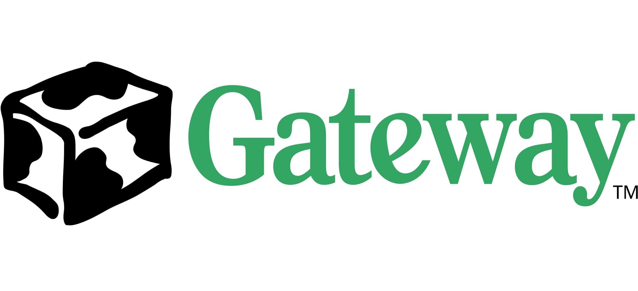
The name of the company was changed to Gateway in 1998 and the new logo was introduced in the same year. The company adopted a cow patter as its main theme, and the new logo consisted of a smooth serif inscription in green, and a stylized box with white and black spots, placed above or on the left from the wordmark. The cow-block became one of the most recognizable symbols in history, and came back to the company’s visual identity later, in 2004.
2002 — 2004
In 2002 the brand tried to adopt a new icon, but it didn’t last long. The iconic cow-block turned into a black smooth spot with a stylized letter “G” on it. The letter was drawn in clean white lines and looked a bit like a Google emblem. The wordmark was also redrawn and featured a thin and sophisticated serif typeface with its letters rounded and serifs distinct and visible.
2004 — Today
![]()
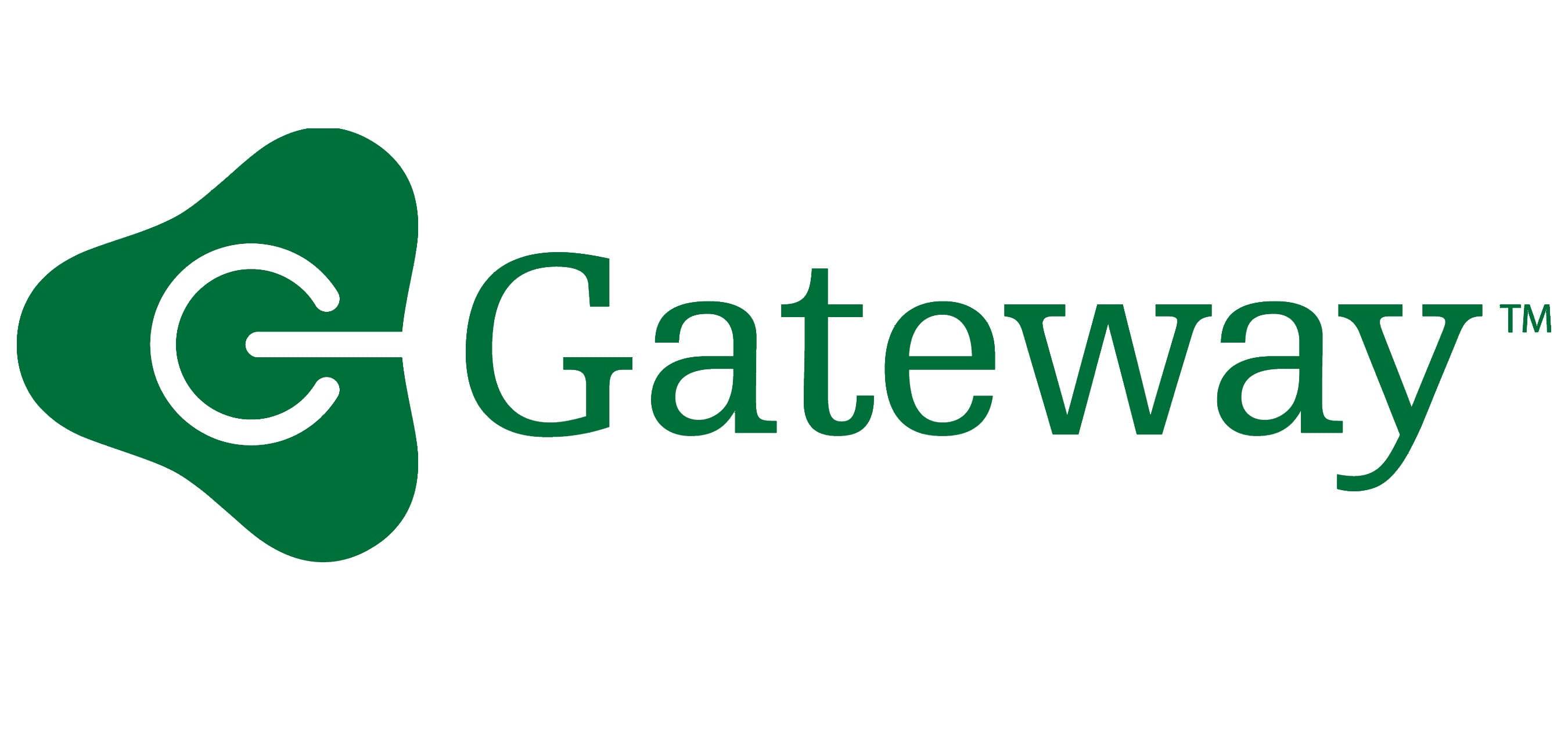
The redesign of 2004 brought back the iconic emblem, redrawing, and cleaning it. There are several versions of the logo available today — with a cow-book outlined, with a green or black wordmark, and an inverted logo, where the main color of the box is black, and the spots are white.
The typeface of the today’s logo featured clean and extended sans-serif shapes and looks minimalist yet solid and progressive.
![]()


