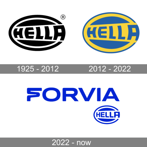
The logo of Hella, a German automotive part supplier, gives a metaphorical hint at the company’s specialization. The hint is pretty subtle, so for most people, the logo alone would not be enough to “decipher” the message.
Meaning and history

Hella is a German company that develops and manufactures components and systems of lighting and electronics for world-famous automobile companies. All products of this company are thoroughly tested before they are released for sale, emphasizing the guarantee of their excellent quality.
One of the world’s most reputable companies in its segment, Hella, was officially founded on June 11, 1899, when the Westfalische Metall-Industrie Aktien-Gesellschaft was registered with the Lippstadt district government.
As for the current name of the company, it appeared much later. In 1908 the name “Hello” was first used for the acetylene gas lamp.Later the brand was extended to the entire range of the company’s products, and in 1926 the company name and logo were registered as a brand with the German Patent Office.
The word “Hella” became an official part of the company’s name only in 1988. The new name was Hella KG Hueck & Co. In 1999 Hella merged with another German label, Beth, forming a company called Hella&Behr. This company specializes in the production of radiators, air conditioners, and modules for cars.
In 2004 another joint venture called “Hella, Behr and Plastic Omnium” was formed, which produces various components for passenger cars and light commercial vehicles, including bumpers, headlights, radiators, etc.
What is Hella?
Hella is one of the most famous German manufacturers of car components. It is known primarily for its optics, which are often included in the original equipment of vehicles from automobile factories. The company was established at the end of the 19th century and today operates worldwide.
1925 – 1990
You can come across a variety of older logos more or less similar to the current one. For instance, there is a black-and-white Hella logo where the “ray of light” effect is more pronounced than in the current emblem. Here, the difference in the width of the central bar is more dramatic, and even the glyphs are more distorted. This has been necessary because the black-and-white color scheme does not give a chance to make the “gold” allusion to the light theme like in the current logo.
Also, we can mention logotypes where the “ray of light” effect was not present and versions where only the first letter was capitalized.
2012 – 2022

The shape of the current Hella logo has been inspired by one of the core products, the headlamp. Even the color palette combining gold (the color of the light) with dark blue seems to represent a lighting product.
The company has used one more way to create a link with this theme: the horizontal bar housing the word “Hella” is narrower in its left part and wider in its right part. Due to this, it may look like a ray of light. To emphasize this effect, the designers have used the letters of varying sizes: starting from the smaller letters on the left to larger letters on the right.
2022 – now

At the beginning of the year 2022, Faurecia acquired the Hella company, turning into the seventh-largest supplier of automotive parts in the world. This logo reflects the new name of the group – Forvia. It is printed in a bright blue color using all uppercase letters. The font looks like it was based on ITC Blair Bold or similar font, but it was customized to have more fluent, rounded strokes and corners. The first letter is also a custom one as it is formed from one line curving back and forth. In the bottom right corner, the logo has the oval emblem of the Hella brand done in a white and blue color palette. This blue color reflects the trustworthiness, responsibility, and strength of the group.
Font and Color
The stylized uppercase lettering from the primary badge of Hella is set in a clean geometric sans-serif typeface with square contours of the characters. The closest fonts to the one, used in this insignia, are, probably, Technicolor Bold, or Monbloc Heavy, but with some significant modifications.
As for the color palette of the Hella visual identity, it is based on a combination of yellow and blue, with smooth calm hues, which on some versions of the badge gain delicate metallic gradients, making up the badge more dynamic and glossy. This combination of colors stands for reliability and trustworthiness, representing the company as a professional one.


