Comedy Central Logo PNG
Comedy Central is the name of the American entertainment tv-channel, which was established in 1991. Today the channel with numerous comedy programs and tv-series is available for watching on almost all the continents and is loved by millions of people for high-quality content.
Meaning and history
The visual identity of the Comedy Central channel is minimalist, stylish, and cool. It perfectly represents the purpose and character of the tv-channel, showing it as a creative and progressive one, and elevating its image.
1988
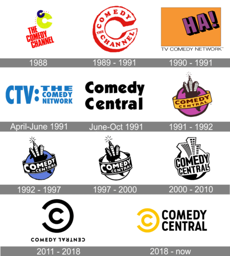
The original name of Comedy Central was “The Comedy Channel”, and this is what you could read on the very first badge, designed for it in 1988. It was a bright and friendly logo, composed ofred uppercase lettering, placed diagonally in three rows under the lime-green and blue emblem. As for the emblem, it boasted an enlarged “C” in green, overlapped by a smaller “C” in blue at its top part, and accompanied by eight tiny red triangles pointing down, placed in one arched line, crossing the blue “C”.
1989 – 1991
During the first two years after the launch of the channel, there were about four redesigns of its logo, as the channel couldn’t find its own unique style, and was ready for experiments. So among the first versions were letter “C” in red, a strict and simple blue wordmark, and a minimalist monochrome inscription.
1990 – 1991
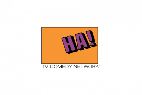
The logo, used by Comedy Central from 1990 to 1991 featured a solid orange rectangular badge with a shaded purple “Ha!” Placed diagonally on the right side. The thin uppercase “TV Comedy Network” wordmark was written under the badge in lightweight straight lines of a traditional sans-serif typeface.
1991 April – 1991 June
For a couple of months in 1991, the network was using a boring blue and white badge, with the “CTV” abbreviation on the left and “The Comedy Network” full inscription on the right, set in three levels and divided from the left part of the logo by two bold dots, placed vertically above one another.
1991 June – 1991 October

For a few more lo another logo was created. A bold title case logotype in black, placed on a white background in two levels. The lettering was executed in a custom sans-serif typeface with interesting cuts of the “C” and “E” lines, which made the whole composition look unique and recognizable.
1991 – 1992
The first constant logo was created in 1991. It was a stylized image of the planet, drawn in purple and black, with three white and black skyscrapers coming out of it, as a symbol of the NewYork City, and a yellow wide ribbon around the planet with the “Comedy Central” lettering in black. The lettering was executed in a bold and simple sans-serif typeface.
1992 – 1997
In 1992 the contours of the emblem were refined and slightly modernized, and the crazy intense color palette was changed to a more professional and modest one — blue, black, and white.
1997 – 2000
In 1997, the channel makes its logo monochrome.
2000 – 2010
The redesign of 2000 brought a new style to the emblem, keeping the idea of the planet and skyscrapers, it was completely redrawn in a more modern and vivid way. The “Comedy Central” inscription was now placed right on the globe, without any ribbons and orbits.
2011 – 2018
The prototype of the logo we all know today was designed for Comedy Central in 2011. It was an emblem, composed of two letters “C”, which were placed resembling of the Copyright symbol — one small “C” inside the bigger one, mirrored.
The wordmark, placed under the new emblem was also unique — the “Central” part was turned upside down.
So despite the simplicity of the colors and lines, it was a truly remarkable visual identity design, following all the trends in contemporary design.
2018 – Today
The logo we all know today was created in 2018 and is based on the previous outstanding version. The emblem remained the same — the copyright symbol with an open circle, but now it is colored yellow and placed on the left of the wordmark.
As for the inscription, it is set in two levels and written in a strict and traditional sans-serif typeface with bold clean lines.

The yellow and black color palette of the Comedy Central logo is a reflection of professionalism and energy, which lead the channel to the new heights and help them conquer new fans every day.


