

![]() Paw Patrol Logo PNG
Paw Patrol Logo PNG
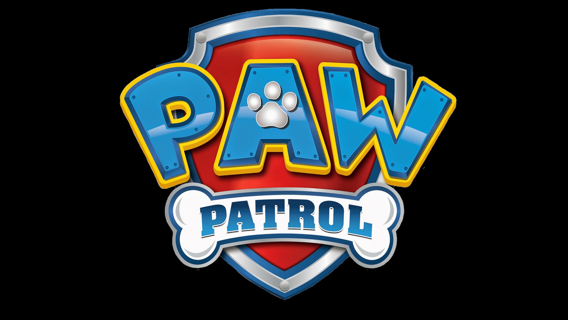
The logo of the television series Paw Patrol conveys both the ideas of the series name. There’s a paw and a bone for the “Paw” and a shield to symbolize “Patrol.”
Meaning and history
![]()
Paw Patrol is a popular computer-animated tv series, created in Canada in 2013 by Keith Chapman. The series tellsthe story of a group of friends rescuers: a boy Zeke Ryder and his friends, brave puppies: Rocky, Chase, Sturdy, Marshall, Skye, Zuma, and Everest.
According to the legend, each puppy has its character and unique abilities that help them in solving the difficulties that arise. The Puppy Patrol is always ready to come to the aid of anyone in the small town. At first, no one took the little rescuers seriously, but the puppies proved in practice that friendship and courage can defeat any trouble.
What is Paw Patrol?
Paw Petrol is the name of a Canadian animated series that tells the story of a company of puppy friends. The series was released on August 12, 2013. Today the series is popular among millions of children around the world, and in addition to the animated show itself, Paw Patrol distributes toys and print products.
2012 – 2013
![]()
The initial emblem is a silver shield-like badge with a yellow core and the show’s name written over it. That last part occupies a big blue plaque that goes beyond the badge’s borders. The top part has the letters ‘P.A.W.’ written in white on it as a sort of acronym, while a small rectangular extension below has a white bone depicted on it. On this bone, there’s a word ‘patrol’ written in the same shade of blue as the surrounding space.
2013 – now
![]()
Like many other famous logos, the Paw Patrol emblem is based on a shield shape. Here, the shield is red, sometimes with a bone pattern, which is clearly visible at a larger scale. There’s a 3D frame with a metallic feel. The shield serves as the background for the lettering: the word “PAW” in capital letters (light blue) and “Patrol” (dark blue) inside a white bone.
Products with the symbol
The Paw Patrol merchandise was introduced in 2014. The first product to cash on the logo was a toy line, which was sold across Canada for a month before being introduced abroad. Today, it’s one of the most commercially successful Spin Master’s brands. As of 2015, toys and games with the Paw Patrol logo brought $245 million, which constituted 25% of the company’s gross product sales.
Versions of the emblem
When the show is launched in a non-English-speaking country, a new version of the logo is sometimes introduced, where the text “Paw Patrol” is replaced by the corresponding text in the local language. This approach was used, for instance, in China. In other countries, the main logo in English is used, paired with the translation (Spain). Also, a mixed approach can be used, when the first episodes or seasons are launched with both the English logo and its translation, while later the text “Paw Patrol” in the main logo is replaced by the translation (Russia).
Font and Color
![]() The bright and heavy lettering from the primary Paw Patrol logo is set in a modified serif typeface with thick square elements. The closest fonts to the one, used in this insignia, are, probably, Aachen Pro Bold, or Superba Pro Wide, but with some significant modifications of the contours.
The bright and heavy lettering from the primary Paw Patrol logo is set in a modified serif typeface with thick square elements. The closest fonts to the one, used in this insignia, are, probably, Aachen Pro Bold, or Superba Pro Wide, but with some significant modifications of the contours.
As for the color palette of the Paw Patrol visual identity, it looks bright and eye-catching, composed of blue and red as the primary colors, and silver and yellow — as the additional ones. These four shades make up a memorable and intense image, evoking a sense of friendliness and happiness.
The Paw Patrol logo as seen in the poster combines two different typefaces. Most likely, the comic style font featured in the word “Paw” is a custom artwork. If you want to find something similar, you may use fonts like Grobold and Minnie, although they are no match. The font used for the “Patrol” part looks like the Aachen typeface, which was developed by Alan Meeks.


