Colorado Buffaloes is the name of an athletic program from the University of Colorado, a public education organization, established in 1876, and located in Boulder, Colorado. The program is composed of 17 men’s and women’s teams, which are members of the Pac-12 Conference.
Meaning and history
Colorado Buffaloes’ athletic teams are all members of the Pac-12 Conference, a collegiate organization, affiliated with the first division of the National Collegiate Athletic Association. The Conference was created in 1915 under the name Pacific Coast Conference, and today has twelve members (hence the new name)c which is all colleges and universities from the Western part of the United States.
What are Colorado Buffaloes?
Colorado Buffaloes is a collegiate athletic program of the University of Colorado, which consists of 7 men’s and 10 women’s (Lady Buffs) teams, competing in various sports disciplines including indoor and outdoor Track & Field, Skiing, Cross Country, Football, Golf, and some others.
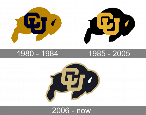
In terms of visual identity, Colorado Buffaloes have been very consistent and stable with their logo. The teams of the program still use the badge, created at the beginning of the 1980s, just its refined and strengthened version. Also, the badge has always featured a gold and black color palette, so no experiments here either.
1980 – 1984
The Colorado a Buffaloes logo, designed in 1980, featured a solid and massive composition, consisting of the bold gold silhouette of a Buffalo bull with massive black lettering on its body and just one small black detail on its head — a horn. The animal was drawn in full-length, facing to the right. The lettering on the buffalo’s body was an intertwined uppercase “CU” monogram, executed in a bold geometric serif typeface, which is very typical for universities and colleges’ visual identity.
1985 – 2005
The redesign of 1985 switched the colors on the logo, making the Buffalo black, and the monogram — gold. The small horn on the Bull’s head was also colored gold now. It was a brighter shade, than on the previous version, more yellow, which created a good contrast with the black background, and made it look cool and vivid, instead of being dramatic in a bad way.
2006 – Today
In 2006 the shade of gold got muted and became more beige. The new monogram was drawn in the same style, but now was slightly italicized, and its refreshed color is now balanced by a bold gold outline of the whole badge, which merges with the “CU” abbreviation in two spots. The badge looks powerful and stable, just like the teams of the athletic programs from the University of Colorado.


