Colgate Raiders is the name of an athletic program from Colgate University, which was established in 1819 and is based in New York State. The sports program of the liberal arts college is composed of 23 men’s and women’s teams, which are all part of the first division of the National Collegiate Athletic Association.
Meaning and history
Apart from playing in Division I of the NCAA, Colgate Raiders athletic program is a member of the Patriot League, an association founded in 1986, and the Colgate Raiders hockey team plays in the ECAC Hockey, established at the beginning of the 1960s, and being one of the six NCAA ice hockey leagues of the first division.
What is Colgate Raiders?
Colgate Raiders is a collegiate athletic program of Colgate University, which consists of 11 men’s and 12 women’s teams, which compete in various sports disciplines, including indoor and outdoor Track & Field, Swimming & Diving, Cross Country, Basketball, and many others.
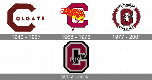
As for the visual identity, the logo of the athletic program from Colgate University has always been executed in a dark red color palette, which is a representation of passion and power, confidence, and excellence. The badge of the Colgate Raiders has undergone several redesigns throughout the years, but all of its versions are based on the capital letter “C” as the central element, and all of them boast a pretty simple idea.
1940 – 1967
The Colgate Raiders logo, introduced in 1940, stayed with the athletic program for almost 17 years. It was a dark red, almost burgundy-brown badge, composed of an enlarged angular capital “C”, followed by an “Olgate” lettering in smaller capitals of a bold sans-serif typeface with the letters featuring rounded shapes. The whole badge was set in one shade of red, and each of the elements had a thin black outline.
1968 – 1976
The redesign of 1968 has redrawn the “C” with fewer angles but still kept its geometric style. The color of the letter became pinker but remained dark. The additional lettering was removed from the badgeD and now the capital “C” was accompanied by the image of a torch with flame, placed in its negative space. The flame of the torch was a bit “blown” to the left, as if someone invisible, holding it, was moving to the right.
1977 – 2001
In 1977 the Colgate Raiders logo gets a more modern and confident look, with the letter “C” redrawn, becoming much bolder and slightly narrower, and placed on a white background inside a badge with a circular frame. The letter now featured a double white and black outline and a black cursive “‘gate” in the lowercase, overlapping it diagonally. As for the framing, it was set in the same burgundy shade, as the body of the letter, and had two white inserts on top and at the bottom, with two black wordmarks in all capitals set on them: “Red Raiders” and Athletics, on top and at the bottom respectively.
2002 – Today
The redesign of 2002 simplified the composition of the Colgate Raiders logo to just a burgundy “C” in a double outline of light and medium shades of gray, set on a solid black background, repeating the angular shape of the letter. The black cursive “‘gate” got its typeface refined too, and now had each of the letters outlined in white for better visibility.


