 South Carolina Gamecocks Logo PNG
The University of South Carolina is represented in intercollegiate athletics by 19 varsity teams sharing the same name and logo.
Meaning and history

South Carolina Gamecocks represent the University of South Carolina, which has been founded back in 1892. Since then, they had played over 100 seasons and have a W-L-T record that shows slightly more wins than losses with about 10% ties. They have numerous achievements, including several bowl appearances, a couple of SEC championships, several National Championships, as well as College World Series appearances, and more. Their mascot appeared back in 1901 when Richard Jakes (alumnus) suggested that it is associated with tenacity, perseverance, and courage. The whole university community proudly carries this symbol throughout all these years.
1961 – 1966

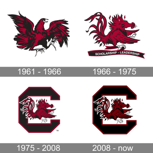
Although the Gamecock symbol was used by the university since the beginning of the new century, this logo appeared only in 1961. It is done in a black and scarlet red color palette with a bit of white and shows a rooster that is ready to attack. Its wings are spread in flight and the whole image shows determination and not a hint of hesitation. This is exactly what players feel when they go with a goal to win another game.
1966 – 1975

The updated logo features a lighter color palette with less black in the Gamecock drawing. The gamecock itself, though, is no less brave and daring. Its tail and flying feathers create a dynamic and powerful image. The bird holds a black with red border ribbon in its foot that curves underneath. It says “Scholarship – Leadership” in white, sans-serif, all uppercase letters. This inscription reflects that everyone who carries the Gamecock name shows the same perseverance and determination when it comes to these two qualities.
1975 – 2008

The same image of the Gamecock as in the previous logo is used again but without the ribbon. Instead, the courageous bird is framed by a large, geometric letter “C”. It is done in black and has a relatively thick border in the same red as the bird. The overall image is bold and impressive and reflects the seriousness and dedication of the university and its sports teams to their goals and values.
2008 – now

The South Carolina Gamecocks logo features a large “C” with a fighting rooster inside. The bird’s feathers flutter in the wind, and the very position of its body shows it is in the middle of a fight. So, we can say that the logo almost literally represents the name of the team.
The palette is comprised of dark red (garnet) and black. Both the colors can be seen on the emblem where they are featured together with white.
In addition to the crest, the teams also have several alternative ones. Probably the most known of them depicts the same fighting rooster. This time, it appears solo, without the block “C.”
Also, the university has monogram logos in which the letters “S” and “C” are interlaced in an intricate fashion. Here, the glyphs look very refined and elegant. They have unusual ends. In addition to it, there is a simpler and more sporty-looking monogram showcasing the interlocked “U,” “S,” and “C.”
South Carolina athletic program
The program includes football, baseball, and basketball. They play at the NCAA Division I level. The South Carolina Gamecock baseball logo is the same as the school’s primary athletic mark.
South Carolina Gamecocks Colors
GARNET
HEX COLOR: #73000A;
RGB: (115,0,10)
CMYK: (0,100,61,43)
PANTONE: PMS 202 C
BLACK
HEX COLOR: #000000;
RGB: (0,0,0)
PANTONE: PMS BLACK 6 C
CMYK: (0,0,0,100)


