

![]() Collingwood Logo PNG
Collingwood Logo PNG
While the logo of the Collingwood football club doesn’t look like a regular sporting logo, you can feel the heritage and style.
Meaning and history
![]()
We’d like to start the story of the Collingwood logo from the emblem used on letterheads from the club’s earliest days and through the early 1950s. Here, a magpie was depicted on top of a tree encircled by the lettering “Collingwood Football Club.” The tree and magpie looked very realistic, with the exception of the proportions: the magpie was too big in comparison with the tree. Another distinctive feature was a belt design.
In other communications throughout the same period, the club used a simplified version of the same logo. Here, the tree was reduced to the only branch on which the bird was sitting.
1892 — 1950
![]()
The initial emblem for the Collingwood team was introduced in 1892 and this was the first time when the magpie was depicted on the logo of the club. And it was meant to stay. The original badge had a circular shape and a wide framing with the “Collingwood Football Club” written around its perimeter. The magpie sitting on a branch was drawn in the middle part of the logo.
1941 — 1960
![]()
When the Social Club opened in 1941, the logo mentioned above was modified to include the word “Social.”
1951 — 1955
![]()
Around 1951, the club adopted a logo featuring a magpie facing to the right. Instead of a branch, the creature was now standing on a fence.
1955 — 1957
![]()
The annual reports of 1955-1957 comprised a completely different logo. Here, the bird was facing to the left. There was a twig under his feet and an abstract landscape behind his back.
1958 — 1965
![]()
We can mention the very realistic logos used in 1958-1965 and in 1968-1972. The magpie sitting on fencepost had its head turned at a very elegant angle.
1966 — 1967
![]()
In the annual reports of 1966-1967 and 1973-1974, we can see a modified version with the words “Collingwood Football Club” on the background.
1968 — 1972
![]()
With the redesign of 1968, the circular frame was removed and the logo became simpler yet didn’t lose its individuality and elegance. Now it was just a blackbird sitting on the wooden fence and turning its head to the left.
1973 — 1974
![]()
Throughout the following decades, the club used colored versions, shield logos with the magpie facing to the right and to the left.
1975 — 1977
![]()
In 1975 the club decides to bring back its strict and minimalist emblem, created in 1968, the framing was gone again, along with the lettering. The contours of both the bird and the fence remained untouched.
1978 — 1981
![]()
The new badge was introduced by the club in 1978. The magpie was now drawn on a white vertical rectangle and placed on the dark gray crest with the upper part outlined in blue. The “Magpies” inscription in the uppercase was written in a fancy elegant sans-serif typeface and placed above a smaller “Collingwood Football Club” wordmark. On the bird’s body, there was a light gray square badge with a blue chevron placed under the solid blue circle.
1982
![]()
In 1982 the blue color was gone from the club’s visual identity, and the contours of the crest were refined. It was now placed on a black and white square with a vertical striped pattern. The badge with a chevron was also removed from the mage’s body.
1983
![]()
In 1983 the club brings back the circular shape of the badge, placing a black and gray magpie on a white background and enclosing it into a frame in a thin double outline. The “Collingwood Football a club” inscription in the uppercase was written around the perimeter of the frame and executed in a strict traditional sans-serif typeface in thin lightweight lines.
1984
![]()
There was even a logo where the bird was depicted with his wings spread.
1985 — 1991
![]()
The contours of the emblem, designed in 1983 were refined and strengthened in 1985. The wordmark got extended to “Collingwood Football Club Limited” and the lines of the letters became bolder and more confident. The magpie got a bit smaller and now the circular badge looked more balanced.
1992
![]()
To celebrate the club’s 100th anniversary, the new badge was introduced in 1992. The circular badge was changed to oval, and two flags got placed under it, decorated by a wreath. The “1892 — 1992” datemark was placed under the emblem, and the magpie was now standing on a small crest with the “100 anniversary” inscription.
1993 — 2003
![]()
In 1993 the bottom line with the datemark was removed from the Collingwood Football Club badges and the contours of all the elements were emboldened and cleaned. Black accents on the logo became brighter and stronger.
2004 — 2016
![]()
The color palette of the logo switched to complete monochrome with a thin golden wreath in 2004. The emblem started looking more modern and elegant, having the bright blue flag as the main eye-catching element. The wordmark, written around the black oval frame, became more visible and solid.
2017
![]()
In 2017 the club was celebrating its 125th anniversary and the new badge was introduced. This was the first time when there were two magpies on the logo. The birds were placed on the sides from the large circular crest with a vertically striped black and white background and a massive dark bronze wreath. The composition was placed on a light gray background and featured a bold and slightly narrowed black sans-serif lettering under the graphical part.
2018 — Today
Eventually, in 2018, the club opted for a comparatively minimalistic design with black and white stripes on the background.
![]()
Font
The sans serif type has distinctive elongated proportions.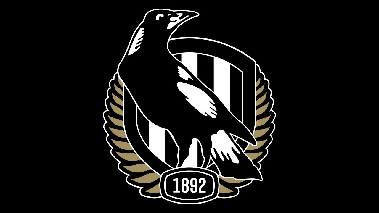
Colors
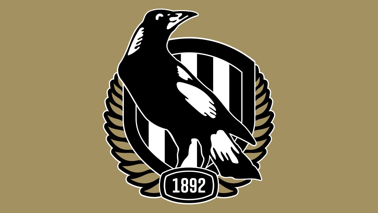
The palette of the Collingwood logo comprises black, white, and a noble shade of gold.


