

![]() Adelaide Crows Logo PNG
Adelaide Crows Logo PNG
Aggressive, distinctive, dynamic, and easy to grasp – the emblem of the Adelaide Crows football club inspires the players and fans and sticks in mind. The way the wordmark touches the beak looks somewhat awkward, though.
Meaning and history
![]()
In the summer of 1990, the AFL permitted the Port Adelaide Football Club to enter into its competition in season 1991. The earliest Adelaide Crows logo was based on a shield shape. It sported a crow in flight with its beak open. Behind its wings and tail, the creature left the signature navy, yellow, and red stripes of the club’s uniform.
In 1997, the logo was slightly tweaked. While the crow itself remained unchanged, the two words of the club’s name changed their proportions. The word “Crows,” which was the biggest on the previous version, grew smaller. By contrast, the word “Adelaide,” which was the largest on the previous version, became bigger. In this way, the club emphasized its place of origin on the logo.
1991 — 1996
![]()
The initial insignia of Adelaide Crows was introduced in 1991 and stayed with the club for five years. It was an elegant white crest with a thick red outline, and a solid dark blue top part, where the yellow inscription in the uppercase was set in two levels. The main part of the crest was colored white and boasted a dark blue image of a crow facing right, with red and yellow stripes coming out of its tail.
1997
![]()
In 1997 the logo was redesigned for the first time. The crest was horizontally stretched and the wordmark was refined — now the “Adelaide” part of the inscription featured a bigger size of letters than the “Crows”.
With the extension of the crest, the contours of the bird were also stretched and now the crow’s beak looked sharper and more massive.
1998 — 2009
![]() This emblem was replaced in 1998. The shield shape was removed, while the navy of the crow grew a little lighter. The lettering, which grew larger and bolder, moved below the crow.
This emblem was replaced in 1998. The shield shape was removed, while the navy of the crow grew a little lighter. The lettering, which grew larger and bolder, moved below the crow.
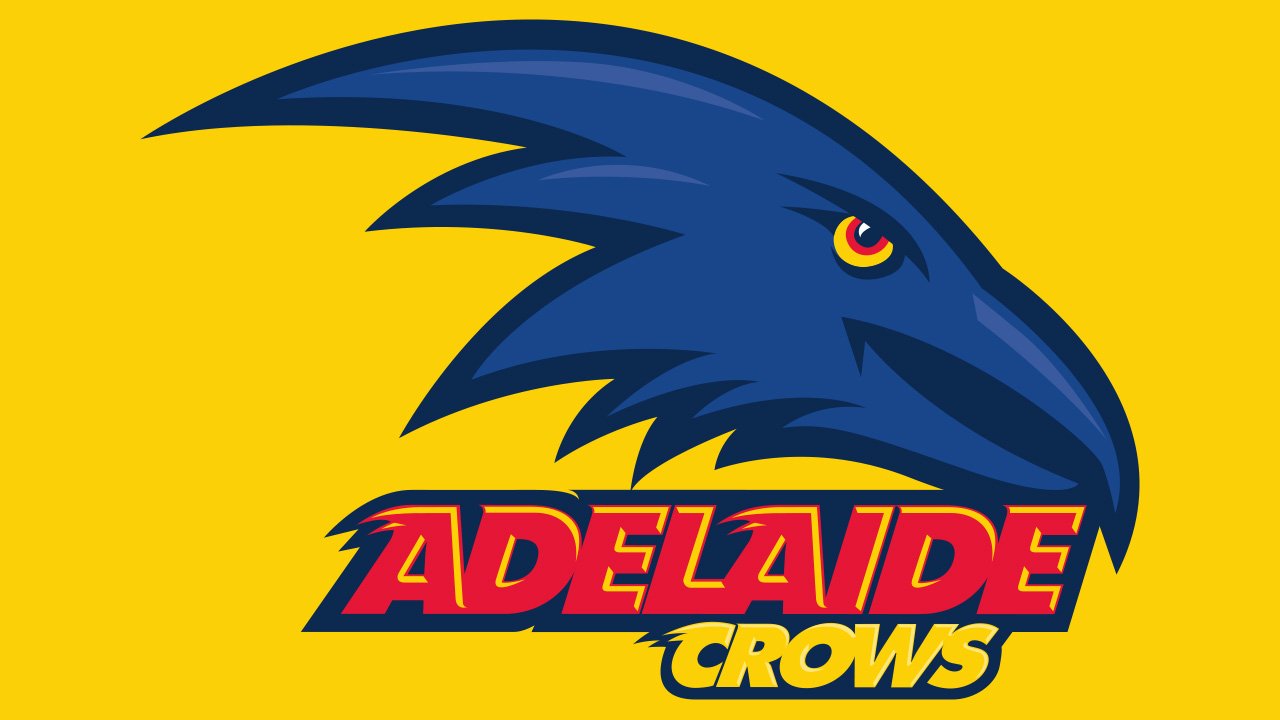
2010 — Today
![]()
Instead of the whole crow, the current logo features only the head. The designer didn’t just borrow the head from the previous logo but drew it from scratch. While the crow, in reality, isn’t that dangerous at all, the creature on the logo had the menacing expression and aggressive style necessary for a decent sports logo. Its sharp feathers only reinforced the impression.
Font
![]()
The sharp elements on the letters create a visual rhyme with the angles of the bird design.
Colors
In addition to the club’s official colors – navy, red, and gold – the Adelaide Crows logo also features white and a lighter shade of blue.


