CNews is a French live news channel that provides 24-hour national and global news coverage. It was launched in 1999 by Canal+ Group.
Meaning and history
The CNews logo is a stylish and modern icon, based on a color palette of red, white and black. It is classic yet contemporary and very memorable.
Being the second most watched news network in France, CNews has to have a bold and striking logo, to be recognizable and give a feeling of reliability and authority to its audience.
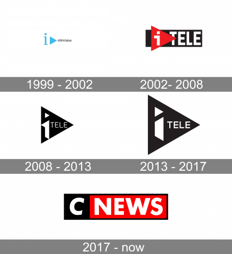
1999 – 2002

The initial badge of the French channel was bright and elegant. Its black lowercase “Television” inscription in a smooth and fancy serif typeface was accompanied by an enlarged sky-blue emblem, composed of the lowercase “I” and a triangle, pointing to the right, and resembling a “Play” button.
2002 – 2008

The redesign of 2002 made the badge of the channel stronger and more modern. The new logo featured a black horizontal rectangle with a white uppercase “Tele” inscription in sans-serif and an enlarged red triangle on its left. The white stylized “I” in the lowercase was placed on the red part of the logo.
2008 – 2013

In 2008 the triangle becomes the main element of the logo. Now it is enlarged and drawn in black, with the white “Tele” written right in it and a bold enlarged “I” with its contours sharpened and modern.
2013 – 2017

The redesign of 2013 balanced the elements of the logo, extending the black triangle and refining the contours of the white lettering on it. The “Tele” part got more air and its lines cleaned, while the emboldened lowercase “I” became a bit smaller yet didn’t lose its uniqueness and character.
2017 – Today

The CNews logo is a black-framed rectangle composed of a black square and a red rectangle with a white wordmark on it. The typeface is clean and bold and using white color in the lettering gives a great contrast to the logo.
The network’s logo is strict and simple yet very confident and energetic. The color palette works good both on mobile screen and on TV.


