

![]() Deadpool Logo PNG
Deadpool Logo PNG
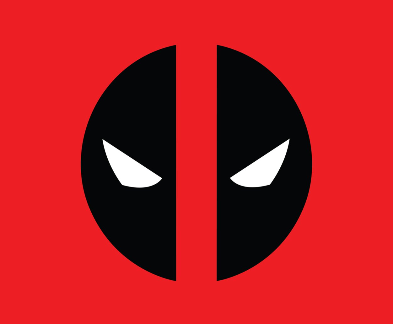
Looking at the famous Dadpool logo one can hardly believe that it appeared as a result of a mere mistake made by the artist.
Meaning and history
![]()
Deadpool was created not as an independent character but as a parody of the DC character Deathstroke. No wonder the original design was devoid of details. In the debut story, which appeared in “New Mutants” #98 published in February, 1991, the hero did not have any emblem on the buckle of his belt. The same approach was used in several following appearances, as well as the first two miniseries.
Emblem
However, in the course of time, Deadpool became much more than just a parody. A new artist, Mark Brooks, was assigned to work on the following stories.
Symbol
Before Brooks started his work, he checked the way past designers drew the character. Yet, some of the details slipped his mind. For instance, he could not remember correctly what the belt looked like, so he just drew what he remembered. That was how the circular buckle with two “eyes” appeared. Later, Brooks mentioned that was a mistake he was pretty happy to have made.
Font

The Deadpool logo does not include any inscriptions, so there is no need for a specific typeface.
Color
![]()
In addition to the iconic combination of red and black, the white color is used for the eyes.


