Cinar is a former Canadian entertainment company that originally specialized in children’s television programming. Established in 1976 by Micheline Charest and Ronald A. Weinberg, this entity was once a significant player in the entertainment sector. Headquartered in Montreal, Quebec, Cinar was involved in the creation and distribution of popular children’s television shows. By the end of the 20th century, the company expanded its operations, spanning across North America and certain global territories. However, later in its journey, Cinar faced numerous controversies and legal challenges, which affected its reputation in the industry.
Meaning and history
Founded in 1976 by Micheline Charest and Ronald A. Weinberg, Cinar quickly rose to prominence as a top-tier producer of children’s content. Throughout its prime years, it produced iconic shows that resonated with audiences globally, setting standards in children’s entertainment. Notably, the company was part of the masterminds behind renowned series that many grew up watching. However, as time progressed, Cinar was embroiled in financial scandals, which shook its foundation and standing in the entertainment domain. These issues led to various legal actions and eventually, by the early 2000s, the company was sold and rebranded, marking the end of the Cinar era. The legacy of its foundational years, though, remains notable in the annals of television history.
What is Cinar?
Cinar was a Canadian entertainment company, best known for its dedication to children’s television programming. Founded in 1976 in Montreal, Quebec by Micheline Charest and Ronald A. Weinberg, the company became renowned for producing memorable kids’ shows. However, despite its early successes, Cinar faced controversies in its later years, impacting its standing in the entertainment world.
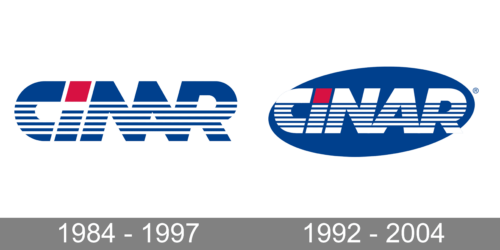
1984 – 1997
Dominated by striking blue tones, this cropped logo presents the brand name “CINAR” in an avant-garde design. Geometric precision is evident with horizontal striping, emphasizing depth and perspective. A solitary red square breaks the monochrome theme, lending a pop of contrast and drawing the eye. The stylized lettering feels modern and technologically influenced, emphasizing forward-thinking and innovation.
1992 – 2004
Set against a pristine background, the “CINAR” logo stands out with its bold blue color palette. Horizontally striped patterns within the letters create a sense of motion, suggesting dynamism and continuous evolution. The stark contrast between the saturated blues and the solitary red square adds intrigue, making the design memorable. Overall, the design encapsulates a blend of modern aesthetics and industrial vibes.


