Chupa Chups is an iconic brand of lollipops manufacturer, established in 1958 in Spain. Today the label is owned by Perfetti Van Melli and distributes its products all over the world.
Meaning and history
Derived from the Spanish word for “to suck”, “chupar”, the brand’s tag became synonymous to a ball-candy worldwide. Since the day of its creation, Chupa Chups has become the most celebrated confectionery in the world.
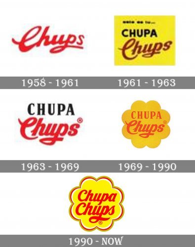
The Chupa Chups visual identity was pretty simple and modest during the first ten years after the brand’s creation. It was based on a wordmark written in two different styles — all capitals of “Chupa” were executed in a strict serif typeface, while the playful “Chups” was written in a bold cursive with the elongated curved tail of the letter “P”.
Everything changed in 1969 when the new logo was designed by one of the biggest figures in the art world, Salvador Dali. The artist placed the brand’s logotype inside a yellow daisy and insisted on placing the insignia on top of the candy, not on its side. The wordmark was colored red.
1958 – 1961

The very first logo for the famous lollipops was introduced in 1958 and featured only a light red “Chups” inscription in a custom cursive typeface. The lettering was placed on a white background and had no additional details.
1961 – 1963
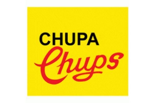
In 1961 the “Chupa” part was added to the logo. It was written in all capitals of simple sans-serif typefaces in black, above the custom red “Chups” with elongated curved tails of the letters. Both elements were placed on a bright yellow background, looking vivid and evoking a sense of happiness.
1963 – 1969
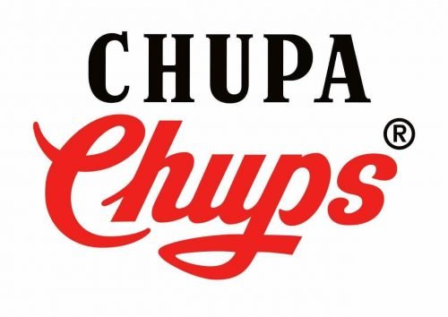
In 1962 the fonts of both logo parts were refined and the yellow background was changed to a white one. The upper, “Chupa” part was now executed in a narrowed extra-bold serif typeface with delicate and sharp serifs on the ends of the thick straight lines, and the “Chups” red cursive was modified and emboldened.
1969 – 1990

In 1969 both parts of the logotype gain red shade and are being placed on a solid yellow background, repeating the shape of a daisy flower. The combination of red and yellow perfectly represents the essence and purpose of the brand and makes the iconic lollipops stand out on the counters and shelves of stores all over the globe.
1990 – Present
Not much changed in the iconic logo since it was created. The shape of the daisy was slightly refined and gained a white and red outline and the nameplate now is written in one typeface, which is still the signature bold cursive. The color palette of the Chupa Chups logo was also a little modified — the yellow became lighter and red brighter.
Font and color
The custom sans-serif cursive of the Chupa Chups visual identity looks sleek and elegant. The font was created exclusively for the brand but is pretty similar to such typefaces as Skate Bold and Bolero, but with lines and contours modified.
The red and yellow color palette of the brand’s visual identity is an absolute eye-catcher, evoking a sense of energy, joy, and fun. The white and gray details of the logo’s outline add a professional touch to the whole composition, pointing to quality and reliability.


