Mentos is a brand of soft mint candies, which was launched in 1932. Today the brand is a part of Perfetti Van Melle and its products are distributed in more than 100 countries across the globe.
Meaning and history
The concept of the product was born during a train ride to Poland, which brothers Michael and Pierre van Melle undertook back in 1932. It was then that they came up with the idea of peppermint-flavored caramel candy. The name – Mentos – was introduced simultaneously. However, the familiar packaging, the rolls, appeared only in 1960.
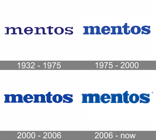
1932 – 1975

The initial Mentos logo was the same blue wordmark they always had, except with thinner, sharper letters and a somewhat darker shade of blue.
1975 – 2000
Around half a century ago, the rolls already featured the word “Mentos” in a lowercase sans. The letters were dark blue – even the shade was pretty close to the current one.
There was hardly anything distinctive about the type, except for the “t,” which had a slightly unusual top. The proportions were classic, which provided decent legibility. Similar to many other older fonts, this one played with the varying thicknesses of the strokes, although it was not overdone.
In 1991, the “Freshmaker” slogan was added. It showcased a font that looked somewhat similar but was a sans serif one. The slogan was white on the red background and had the initials capitalized.
2000 – 2006
The design forces behind the brand made only a tiny concession to the minimalist trends. For instance, they made the wordmark a little bolder. This did not result in a wider design as they saved some space by slightly shortening the serifs on the “m” and “n,” as well as by cutting the ends of the “e” and “t.” As a result, they made the lettering a little simpler and better legible without changing the core.
2006 – Today
The Mentos logo has made one more step towards minimalism. Once again, the serifs have been shortened and the letters have grown somewhat plumper. What is even more noticeable is that light blue highlights have been added. Due to them, the wordmark has got some volume.


