Chuck e. Cheese’s is the name of an American chain of fast-food restaurants and family entertainment centers, which was established in 1977 in Texas, and by today has grown into a huge company with more than 500 locations in The Americas, India, and the Middle East.
Meaning and history
Chuck e. Cheese is a popular family destination, which offers its customers not only a wide fast food menu but also various attractions for kids and parents. The chain’s restaurants serve pizza and other popular fast-food menu items, as well as offer arcade machines, rides, and various performances.
The chain of entertainment centers was opened by Nolan Bushnell, a co-founder of Atari, one of the world’s leaders in the electronic entertainment segment, in 1977 in Texas. The idea behind the restaurant chain was the promotion of video games, developed by Atari. As for the menu, the founders decided to follow the most reliable way — pizza-based fast food.
Chuck E. Cheese in its original state stayed alive for less than 7 years, claiming itself bankrupt already in 1984. However, in 1985, the chain was acquired by the Brock Hotel Corporation.
What is Chuck e. Cheese?
Chuck E. Cheese is an American chain of family restaurants and entertainment centers, which was founded in Texas at the end of the 1970s. Today the company operates internationally, with more than 600 locations in North and South America, the Middle East, and India.
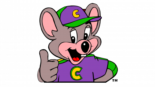
In terms of visual identity, the only element of the Chuck E. Cheese badge, which has survived numerous redesigns, is the image of the company’s mascot, a gray mouse. Although its image has been significantly changed since the original version of the badge was introduced in 1977, the color palette and the playful mood remained the same.
1977 – 1981
The original Chuck E. Cheese badge, designed in 1977, has stayed with the company for a bit less than four years. It was a bright and lively logo, composed of a blue and red horizontally stretched banner with bright yellow lettering written across both of its parts. The image of the gray mouse was drawn over a white background in the center of the upper part of the logo, with its top border arched and decorated by yellow dot lights, placed all around the perimeter of the badge.
1979 – 1981 (signage)
The redesign of 1979 has redrawn the previous emblem in a more laconic color palette — with a black background and yellow contours and lightbulbs. The emblem with the mouse was executed in a black-And-white style, with the mascot contoured.
1981 – 1984
The redesign of 1981 strengthened the Chuck E. Cheese badge and made its shapes and color palette more brutal and strong. The new version of the logo featured more square elements, with the blue changed into black. The mouse was also redrawn and now placed against a solid black background inside the circular element in a dark red outline.
1984 – 1992
After the acquisition of the restaurant chain by Brock Hotel Corporation, an alternative version of the badge was created for it in 1984. It was almost the same badge as the previous one, but with simplified lettering, where the yellow tagline “Pizza Time Theater” was completely removed from the composition. As for the other elements, they remained almost untouched.
1990 – 1994
In 1989 the Chuck E. Cheese badge was refined again. Keeping the contours and the idea of the previous badge, the logo was redrawn in a white and green color palette with red-to-orange gradients, used for the bold uppercase lettering, placed above the diagonally-set cursive “Pizza” tagline, with its smooth rounded letters shadowed. As for the louse emblem, it stayed in its place, but was redrawn in white and green, and placed on a solid red background with a wide yellow outline of the circular medallion.
1993 – 1998 (signage)
The bold green outline of the Chuck E. Cheese badge was removed in 1993, and all the elements of the logo were refined and strengthened. The green shadow of the “Pizza” wordmark was also erased, and now the only green element on the badge was a circular frame of the medallion with a mouse. This part of the logo was completely redrawn; with the gray mouse wearing a bright yellow sweatshirt, decorated with two green stripes, and a red cap. The mouse was placed against a dark red background and had its arms stretched to the sides, coming out of the medallion.
1994 – 1998
The second era of Chuck E, Cheese’s visual identity history started with the logo, designed for the chain in 1994. The gray mouse was redrawn in a more modern and confident style and was now wearing a red sweatshirt, being placed on a plain white background, above the new red and black lettering. The refined inscription featured heavy uppercase characters in a geometric sans-serif font with straight cuts and sharp angles of the bars.
1995 – 2001 (signage)
A new color palette was adopted in 1995, however, the composition hasn’t been changed at all. The lettering featured a gradient scheme, going from red on top to yellow at the bottom, and the brand’s mascot got his cap red, with a yellow star on it, and his sweater yellow with green details.
1998 – 2004
The redesign of 1998 has kept the composition and all contours of the elements in the Chuck E. Cheese badge, but refined the color palette, turning the sweaters of the mascot into yellow ones, and its cap into a red with a yellow “C” on it. As for the lettering, placed under the emblem, it was now written in a red-to-orange gradient with a thin green shadow and black outline.
2004 – 2013
In 2004 the Chuck E. Cheese badge was redesigned again, and this time it was not only about the color palette, but also about the mouse on the emblem, set on the top part of the logo. The mouse changed its pose and was now smiling, turned a bit to the left, wearing a purple jersey with green stripes and a yellow “C”, and a cap in the same color palette. As for the wordmark, it got plain red, with the outline and shadow of all uppercase characters becoming solid black.
2012 – 2019
The redesign of 2012 simplified the color palette of the Chuck E. Cheese badge and changed the graphical element of the logo. The emblem now featured only the head of a mouse in gray and white, with the large caricaturish eyes of the animal colored in green. As for the inscription, placed under the emblem, it was set in the same bold and modern sans-serif typeface; but in a solid shade of red with no outline or shadowing.
2015 – 2017 (signage)
This badge features a voluminous image of the mouse mascot, drawn waving on a background with a gradient red circle in a thin black outline. The emboldened geometric inscription here was set in a more crimson shade of red, repeating the color of the circle.
2017 – 2019
In 218 the Chuck E. Cheese logo was refined one more time, as the name of the chain was switched to “Chuck E. Cheese Pizzeria & Games”. The emblem with the head of the mouse was redrawn in a smaller size and placed on the left part of the badge, followed by two-leveled lettering in red and black, with the upper “Chuck E. Cheese” in a bold red cursive, and the bottom “Pizzeria & Games” executed in the uppercase of a medium-weight sans-serif font, in black.
2017 – 2019 (signage)
The “Pizzeria & Games” part was removed from the name of the company, and from its badge too. The portrait of the brand’s mascot was now placed over a solid red circle in a double gray and white outline, and the lettering was enlarged and refined, being written in two levels, on the right from the graphical part.
2019 – Today
The redesign of 2019 has brought back the iconic sans-serif typeface of the Chuck E. Cheese logotype and enlarged the graphical part of the logo. The emblem with the gray mouse on a red circular medallion is now set above the two-leveled wordmark in a heavy sand-serif, with all capitalized characters executed in flat red with no outlines or shadows.
Font and color
The bold and funky lettering from the primary badge of Chuck E. Cheese is set in a heavy sans-serif typeface with straight cuts and sharp angles on the bars. The closest fonts to the one, used in this insignia, are, probably, Italiano Fushion New Extra Bold or Kabel Pro Black l, but with some minor modifications of the contours.
As for the color palette of the Chuck E. Cheese visual identity, it is based on red and gray, with some green and white additions, which create a more vivid image, adding energy and motion to the logo. Red is the color of warmth and love, and these are the feelings, which the company tends to give to its customers. As for gray, white, and green, they are used for the drawing of the brand’s mascot, a mouse.
When did Chuck E. Cheese change its logo?
The latest redesign of the Chuck E. Cheese logo was held by the company in 2019, and the new badge represents the shortened version of the previous logo, created for the brand in 2017. The main hero of the new concept is the emblem, and the lettering was rewritten in a smaller size l, being placed under the medallion.
Who is the owner of Chuck E. Cheese?
The Chuck E Cheese brand the fast food restaurant chain was established in the United States in 1977 and bought by Apollo Global Management in 2014. However. This collaboration did not last long and in 2020 the chain was acquired by Monarch Alternative Capital, an American investment fund, which also owns the Peter Piper Pizza chain.
Why did Chuck E. Cheese change its mascot?
At the very beginning of Chuck E. Cheese’s history, the mascot of the restaurant chain was a rat, but a bit later the company decided it was not very appropriate and friendly, and replaced the rat with a mouse. The new mascot became more popular, as looked playful and kinda, evoking only positive emotions in both adult customers and kids.
What does the “E” in “Chuck E. Cheese” stand for in a meme?
According to the company, the “E” in the name of the fast food restaurant chain stands for “Entertainment”. The creative director of the chain even deciphered the whole name of the brand, which in his words is “Charles Entertainment Cheese”, so Chuck suddenly became solid.
What does the Chuck E. Cheese Logo symbolize?
The funny and friendly Chick E. Cheese logo, executed in a red and gray color palette, represents the mascot of the company, Chuck the Mouse, smiling and welcoming people at his place. The color palette of the badge stands for friendliness and caress, while the modern geometric font of the lettering shows the company as a progressive and professional one.
What was the first Chuck E. Cheese logo?
The very first Chuck E. Cheese logo, designed for the restaurant chain in 1977, featured a horizontally stretched rectangular banner in red and blue; with rounded ends, and the contour embedded by red lights. The central part of the badge was decorated with a white element with the depiction of a rat in a red bow tie and a red hat with a wide yellow stripe on it. The lettering was set in two lines, with the bold uppercase characters drawn in two shades of yellow — a lighter one for the red part of the badge, and a brighter yellow for the blue area.
What is the meaning behind Chuck E. Cheese?
The main thing about the Chuck E. Cheese logo is the accent on the “Entertainment” part of the brand’s idea and name (as the “E” in the name stands for “Entertainment”). With the bright shades and a playful mouse on the logo, everything here yells “Fun and Joy!”.
What is the Chuck E. Cheese slogan?
The slogan, which was created for the Chuck E. Cheese restaurants chain in 2014, is “Where a Kid Cab Be a Kid”, which brilliantly reflects the essence of the franchise and its main specialization — entertainment. This slogan has replaced the older version, which stayed with the company for decades and sounded like “Pizza Time Theater”.
Is Chuck E. Cheese‘s mascot a rat or a mouse?
For the first years of its existence, Chuck E. Cheese has been using an image of a rat in its logo. However, initially, the founder of the company wanted it to be a Coyote, as he wanted to name the franchise “Coyote Pizza”. But the rat came out and stayed with the brand until 1993. In the 1990s the rat was replaced by a friendly mouse, as the owners decided to make the badge of the chain more welcoming and playful, and the rat is not the animal, most commonly associated with joy and happiness.


