

![]() Wonka Logo PNG
Wonka Logo PNG
What makes the Wonka brand stand out is that it was inspired by a fictional chocolate factory. Hardly a surprise, magic was a prominent theme in the product design.
Meaning and history
![]()
The Willy Wonka logo, packaging, and marketing styles were heavily influenced by Charlie and the Chocolate Factory, a classic novel for children written by Roald Dahl, as well as its first film adaptation. The introduction of the brand at the end of spring 1971 took place a month before the movie was released.
The bars were discontinued in 2010 because their sales left much to be desired. The brand was eventually renamed Nestlé Candy Shop. The candies that were previously offered under the Willy Wonka brand were sold in the packages with only a small word “Wonka” in the top left corner, which eventually disappeared.
What is Wonka?
Wonka is the name of the former chocolate brand, owned by the Nestle company. The brand was established at the beginning of the 1970s, and discontinued in 2018., but its name was changed to the Nestle Candy Shop in the middle of the 2010s.
1971 – 1981
![]()
The original Wonka logo was introduced in 1971 and featured a black and white composition, with the white stylized portrait of Willy Wonka on the left, underlined by the “Willy” lettering, that was arched, creating a circular shape, and the “Wonka” inscription logo with the “wings” of the “W” elongated and arched to the sides. This badge was in use by the brand until the middle of the 1990s, even though it was accompanied by two other logos.
1980 – 1982
![]()
In 1980 the brand gets an additional logo, executed in a warm chocolate and beige color palette. The portrait of Willy Wonka greeting people, touching his hat, was enclosed into a circular frame and underlined by an arched uppercase lettering in a fancy rounded sans-serif typeface.
1981 – 1993
![]()
This logo features a playful and whimsical design, with a stylized portrayal of Willy Wonka, the fictional character. The triangular background suggests a candy wrapper shape with a blue color that is inviting and friendly. The character is wearing his iconic hat and bow tie with a cheerful expression. The “Willy Wonka’s” typeface is fun and bubbly, hinting at the magical and fantastical elements of the brand’s identity.
1993 – 1996
![]()
In this version, the logo maintains its playful essence with a simple black-and-white design. The image of Willy Wonka is outlined with dynamic strokes, giving it a hand-drawn feel. The “Willy Wonka” font is whimsical and uneven, contributing to the logo’s unique charm and emphasizing the brand’s imaginative nature.
1996 – 1999
![]()
The original package showcased the word “Wonka” where the initial “W” “wore” a magician’s hat. The word “Wonka” was white, while the hat was gold. Also, there was the word “bar” in gold below. Both the words featured similar typography. Each of the glyphs looked unique. The artistic curves on the “W,” “K,” “A,” and “R” added a distinctive fairy-tale touch.
1996 – 2008
![]()
In 1988, Sunmark Corporation, which owned the brand, sold it to Nestlé. Gradually, Wonka became an umbrella brand for a variety of sweets and chocolate products, including SweeTARTS, NERDS, Laffy Taffy, and more. They were sold in more than 15 countries worldwide.
Nestle developed another version of the packaging for the bar. The hat moved to the right part of the “W” and was colored blue. The type grew less elaborate, though it retained some of its “magic” (note both the “A’s” and the “R,” for instance). Also, the wordmark was now easier to read for the kids, who were the target audience.
2008 – 2015
![]()
The script on the Wonka logo featured on the chocolate bar grew a little lighter, while the shape of the glyphs still echoed the original wordmark. The violet background supported the “magic” theme.
2015 – 2018
![]()
This design sees a departure from the previous character-centric logos, opting for a bold and colorful “Candy Shop” typeface in a swirling candy style with highlights and shadows, giving it a three-dimensional candy-like appearance. The “Nestle” branding is subtly included, indicating corporate ownership. The font choice and styling reflect a sense of fun and sweetness, targeting a youthful audience.
2023 – Today
![]()
The most recent logo is minimalist and modern, with the “Wonka” wordmark in a playful, curvilinear typeface that suggests creativity and whimsy. The use of purple evokes a sense of luxury and mystery, which is often associated with the Wonka brand, while the swirls in the lettering add a touch of the brand’s fantastical and imaginative qualities.
Font and color
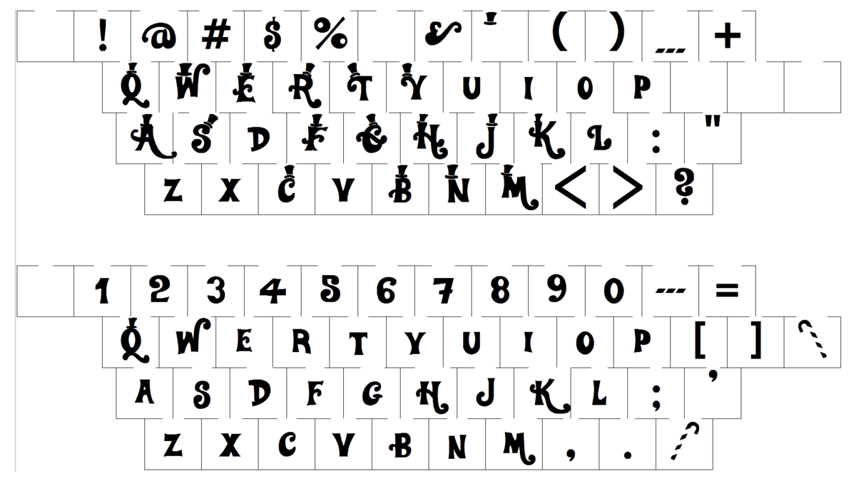
The last Wonka logo, designed in 2008, has its fancy and elegant lettering executed in a custom designer typeface, which has no commercial analogs. The bold outlined letters have their bars elongated and curved, with vertical lines having their bases square and stable.
As for the color palette of the Wonka visual identity, it is composed of purple and white, the colors, which create a bright and fresh look, evoking a friendly feeling. Purple is also known as a symbol of mystery and adventures, which seems to be pretty logical for the brand, created as an honor to the famous literature character.


