Mars is a famous brand of chocolate bars, which was established in 1932. Today the company is one of the largest world manufacturers in its segment and owns several labels of bars, which are loved and recognizable across the globe.
Meaning and history
Mara is an iconic brand, which is popular in every country across the world. It is a legend. And as a legend, the label has a very strong and recognizable visual identity, which was first created after the company’s foundation and was only slightly modified by today.
The Mars logo is composed of a wordmark. That’s it. Bold red lettering in a yellow outline placed on a black background — the brand’s style was created in the middle of the 20th century.
Later, in the 1908s, the wordmark was placed on a black background, which was repeating the contour of the lettering, which gained a stronger and more modern font.
What is Mars?
Mars is the name of one of the world’s most popular chocolate bar, which has been known globally since the middle of the 20th century. Created in the United States in 1932, today this bar with caramel and milk chocolate is familiar to people of all ages and all countries.
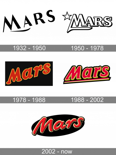
1932 – 1950
The logo, used by the Mars brand in the 1930s — 1940s, comprised a diagonally-oriented lettering in the uppercase, with the first letter enlarged, written in black lines against a white background, and accompanied by a short delicate stroke under the first two letters of the wordmark. The geometric sans-serif font with sharp angles and straight lines made he badge look progressive and confident.
1950 – 1978
The redesign of 1950 has created a more stable and professional image for the Mars brand. The lettering was now set in a straight horizontal line, with the bold characters outlined, and the bar of the “M” elongated, underlining the first two letters. The composition was complemented by an outlined five-pointed star, set on the left of the “M”.
1978 – 1988
The original Mars emblem was composed of a diagonally placed red lettering in a dark yellow outline, placed on a plain black background. The inscription was executed in a title case of a smooth serif cursive with arched lines, slightly curved tails on some letters, rounded serifs, and some of the lines cut straight. The extra-heavy letters of the wordmark looked friendly and very professional at the same time, creating a strong contrast with the dark shade of the badge.
1988 – 2002
The redesign of 1988 refined and strengthened the lettering of the logotype, making the lines straighter and stronger. The wordmark was still placed diagonally, but with a smaller inclination. The black rectangular banner was replaced by an additional black outline of the inscription, and a bold tricolor underline was added to the logo, framing the “Mars” and evoking a sense of completion and balance.
2002 – Today
The logo we know today was designed at the beginning of the 2000s. It is composed of a wordmark in a smooth and modern typeface, which looks hand-drawn and reminds Comic Sans by its playful energetic lines. The lettering is in red with a yellow-gold shadow, looking three-dimensional and dynamic.
The Mars nameplate is placed over a horizontally located black oval, which is slightly stretched, creating a sense of a cosmic plane, adding the meaning of the Planet to the brand’s name.
It is a strong and simple visual identity, built on confident lines and bright color combinations. The logo shows the brand as timeless and powerful, the one, that has always been here and will stay for many years more. An instantly-recognizable classics.
Font and Color
The smooth and friendly lettering from the primary Mars badge is set in a custom rounded font with soft thick lines of the characters. The font in this insignia was designed exclusively for the brand, but has something in common with Comic Sans or Sign Language Italic types.
As for the color palette of the Mars visual identity, it is composed of sleek and intense shades of red, gold and black, which evoke a sense of warmth, quality and precision, and perfectly represent the filling of the famous chocolate bars.


