

![]() Central Perk Logo PNG
Central Perk Logo PNG
As you might know, the life of the main characters of the series Friends took place in New York. Yet, the shooting took place at a studio in Los Angeles. Nevertheless, in New York, you can see the block where the exterior scenes were filmed. Downstairs, under the Bedford Street apartments, there is no coffee shop at all, but a restaurant that looks nothing like the famous fictional Central Perk cafe. For something a little more like Central Perk, one can go to Bloomingdale’s, the real-life iconic New York department store where Rachel Green began her career at Ralph Lauren. It set up a Central Perk themed space. Moreover, everyone who purchases something from the Ralph Lauren x Friends collection is treated to free coffee.
Meaning and History
The television sitcom Friends first aired on September 22, 1994. It lasted for ten years and almost in every series, one can see the Central Perk Café. The first meaning of the name lies on the surface. The name of the cafe is consonant with the name of Central Park in New York. The second association is related to the word perk, which is an abbreviation for percolate – “to brew coffee.” There is also the verb perk up, which means “to cheer up”. So the second word conveys the essence of the establishment – this is a cafe where you can drink coffee to cheer up.
What is Central Perk?
Central Perk is a coffee shop from the TV series Friends. Although it has never existed in real life, the fans can describe all the details of this cozy place. Recently, real Central Perk cafes began to open.
1994 – 2004
![]()
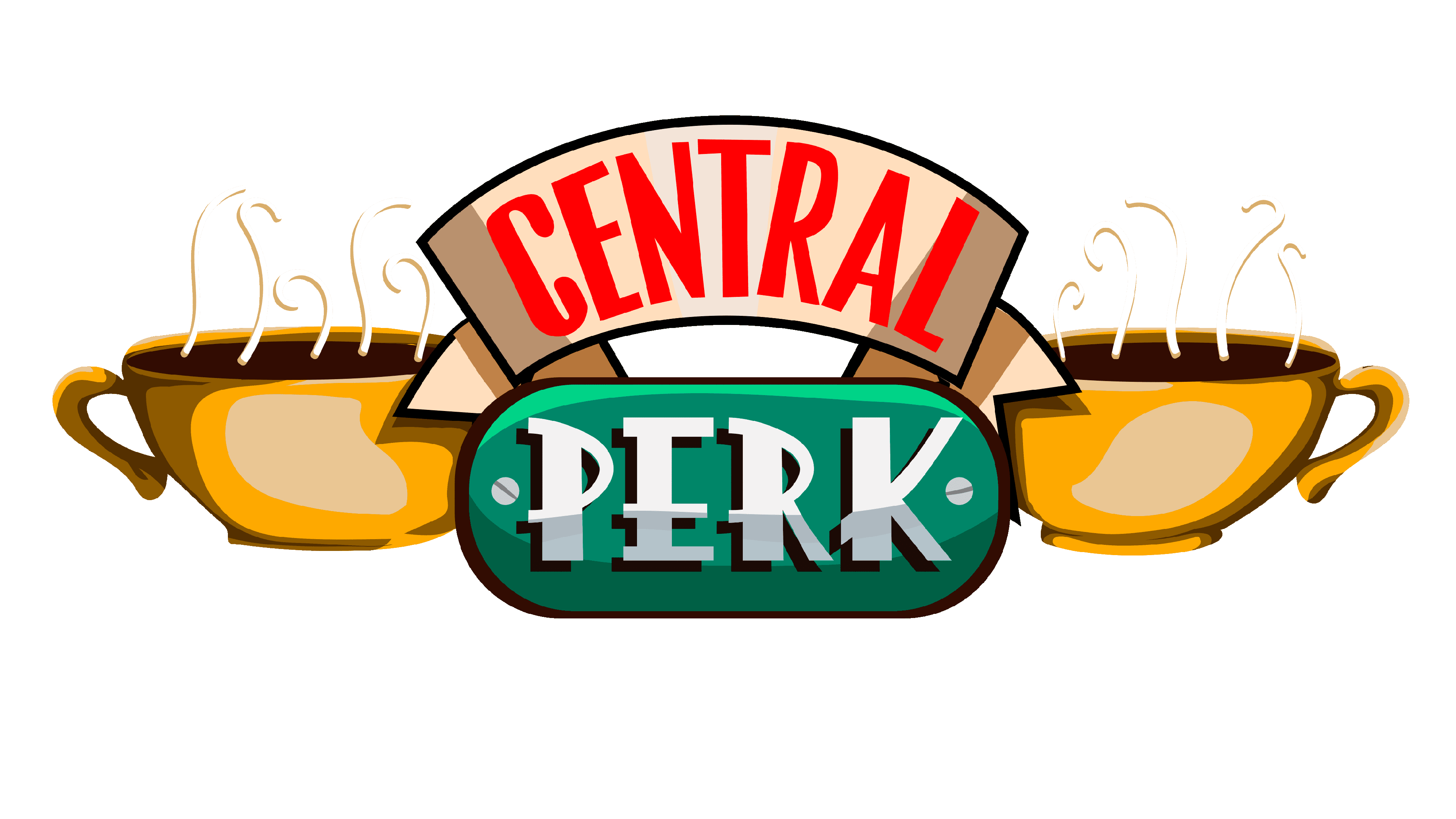
The logo for the fictional café is one of those little details that one has to think about when creating a movie. The designers did not invent something completely new and placed two white coffee mugs with steam coming up on either side of the name. The word “Central” was printed in red on a beige, curved banner using bold, sans-serif traditional letters. The “Perk” part was printed in white on a grassy green rectangular background with rounded ends. It featured a different, funky font, which was a perfect choice for a word that was purposely misspelled. The whole emblem had a white background and outline that gave it that sticker look.
Font and Color
For the logo, the designers chose a bright color palette that should have brought more visitors. The main colors were undoubtedly bright green, bold red, and pure white. There were also black, beige, brown, and light gray elements. The logo features two different fonts, which makes the establishment appealing to a wider audience. The first word featured a bold, sans-serif, geometric font. the second looked more playful and was similar in style to Pinky Style Regular by Attype Studio.


