 Central Florida Knights Logo PNG
Central Florida Knights Are the name of an athletic program from the University of Central Florida, which was established in 1963, and is based in Orlando. The program unites six men’s and ten women’s teams, competing in various sports disciplines, as a member of the American Athletic Conference.
Meaning and history
Central Florida Knights program is considered to be very strong in different kinds of sports. It is currently a member of the first division of the NCAA, and American Athletic Conference, with its membership in the Big 12 Conference already approved too. The program is best known for the achievements of its men’s football club.
What is Central Florida Knights?
Central Florida Knights are the collegiate sports program of the University of Central Florida or UCF. The program consists of 16 men’s and women’s teams, which take part in the games of nine sports disciplines, including Track and Field, Volleyball, Basketball, Golf, Rowing, and others.
In terms of visual identity, the athletic program of the University of Central Florida is loyal to the knight image as the central element of the badge. Even though the program got its current name only in 1993, before that it was called Knights of Pegasus, and also has a depiction of a knight as the design basis.
1996 – 2006
The Central Florida Knights logo, introduced in 1996, featured a gold and white composition with the fully armored knight drawing on the left from a bold diagonally located lettering in two solid black lines. The knight was drawn in total gold, with delicate black outlines of the details, and was holding an exaggeratedly long white and sharp sword, which he was pointing to the right. The sword was crossing the heavy solid black “UCF” lettering, which made it look a bit lighter. The bottom line of the badge comprised the “Golden Knights” inscription in uppercase, executed in the same font and color as the upper level, but in a smaller size.
2007 – 2011
The redesign of 2007 refined and modernized the gold and black badge of the Central Florida Knights athletic program. It was a narrower composition, with the knight’s image moved above the two-levels inscription, which was now set horizontally. The contours of the knight have been emboldened, and more black color was now used for the drawing. As for the inscription, it was set in a completely different style and font, compared to the previous version. The upper line was set in massive gold capitals executed in a custom typeface with some sharp detail. The letters had thin white lines drawn over them for more volume. The black outline of the upper level of the lettering was merging into a black ribbon with the white “Knights” written over it, at the bottom of the badge.
2012 – Today
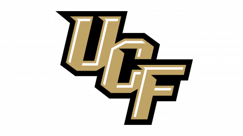
In 2012 the concept of the Central Florida Knight logo was simplified to a single monogram. The three letters “UCF”, drawn in gold, with angular white lines over the bodies, and a bold black outline, repeating the shapes of the letters with sharp elongated serifs, were set diagonally from the upper left corner to the bottom right. No other details are present on the logo.


