Logos of luxury brands represent the taste and quality that go along with these brands. The Celine logo is no exception.
Meaning and history
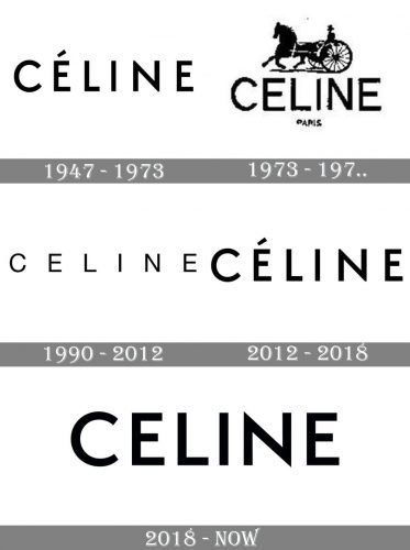
The today-famous women fashion brand started in the 1940s when Céline and Richard Vipiana established the label, specialized in the production of footwear for kids. So the very first logo of a luxury brand featured a friendly red elegant, adored by children.
The fashion house changes its direction in the early 1970s, starting with designing garments and accessories for women, and this is when the first official logo was introduced.
1973 — 1990
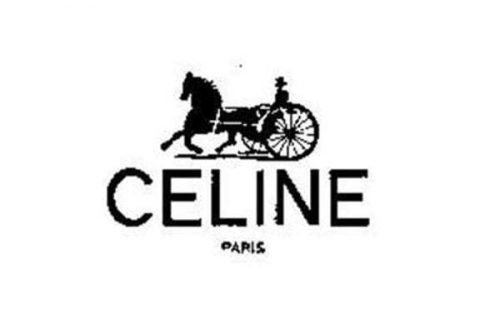
The logo for Céline, designed in 1973, featured a bold sans-serif logotype in monochrome, executed in clean lines with traditional shapes. The letters were placed very close to each other and were accompanied by a black emblem placed above it. The emblem depicted a man in a carriage with a horse, moving from right to left. The delicate “Paris” tagline was placed under the main nameplate in small capitals.
1990 — 2012
The redesign of 1990 made the logotype the only element of the brand’s visual identity. The neat and bold sans-serif letters were placed pretty far from each other, creating a sense of lightness and elegance. The airy wordmark was executed in a font that was very close to Neue Helvética.
2012 — 2018
In 2012 the logo was changed again, and this is when the accent above the letter “E” appears. It adds unique style and character to a simple monochrome inscription, making the logo recognizable and memorable. The lines of this version were bolder than on the previous one, and the letters were placed closer to each other, creating a balanced and solid look. The typeface of this version is similar to Futura BT Pro Medium.
2018 — Today
With the new creative director, Heidi Slimane, Celine decides to change its logo again in 2018. The accent above the letter “E” is being removed and the typeface of the whole inscription — changed to a more modern and bold one. The new logotype is executed in a sans-serif font, very similar to Semplicita Pro SemiBold, with wide contours and distinct lines.
Wordmark Symbol
In the 1960s the brand had a wordmark symbol as well. It was “Celine” that appeared with the word “Paris”. In 2005 the company entrusted typographic designer Hannes Famira with creating a custom typeface for Céline. They chose Semplicità (the 1930s) as the base for it. The work resulted in a new wordmark logo ‒ black, sans serif and uppercase. The new signature mark was to meet the requirements of the contemporary minimalism. “Céline” represented the brand up to August 2018.
Current Emblem
The overhaul of 2018 wasn’t too drastic ‒ they just removed the accent above the “e” and decreased the spacing between the letters. The proportions in the logo seem simpler and more balanced now.
The explanation for the changes is simple ‒ in the era of globalism and digital communication a brand needs to be discussed, shared and typed out in order to survive and evolve.


