Celestial Seasonings is an American brand of the tea manufacturing company, which was founded in 1969. Today is one of the biggest players in the world’s tea market, offering more than 70 varieties of tea.
Meaning and history

The visual identity of the Celestial Seasoning brand has always been very tender and elegant, representing cozy evenings with a cup of hot tea, which is a perfect picture of a welcoming and warm home, full of love and caress.
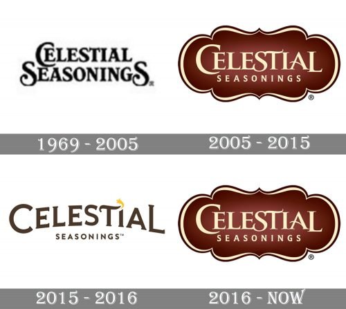
1969 – 2005
The original logo of the famous tea brand was introduced in 1969 and stayed with Celestial Seasonings for almost fifty years. It was a dark brown logotype in a custom serif typeface with thick lines and very small and delicate serifs. The “Celestial” inscription was slightly arched above the “Seasonings” and had a small yellow star replacing the dot above the “I”.
2005 – 2015

With the redesign of 2005, the logo of the brand gained an ornate framing and reversed the colors. Now the light lettering was placed on a brown badge with smooth lines and sharp angles of a medallion outline. The star was removed from the badge, and the typeface of the inscription was switched to a softer and more elegant one.
2015 – 2016

In 2015 the brand brights back its logo from 1969, slightly refining the contours of the serif inscription, but with no further changes.
2016 – present

The badge, created for Celestial Seasonings in 2005 becomes official again in 2016. The ornate light yellow lettering on a gradient brown background of a fancy ornate badge today is an instantly recognizable emblem, synonymous with high-quality tea.
Font and color
The fancy badge of the Celestial Seasonings brand is built on two different styles of inscription. A custom serif for the “Celestial” part, which is close to Trajan Pro Bold abut with the lines of the letters elongated, curved, and softened, and the laconic “Seasonings”, executed in a typeface similar to S&S Amberosa Serif.
The cream and brown color palette of the brand’s logo represents warmth, cosines, and love. It also shows the brand, which values quality, beauty, and is an expert in taste and flavors.


