

![]() CDC Logo PNG
CDC Logo PNG
CDC is an acronym from Center for Disease Control and Prevention. It’s a large American organization, established in 1946 and located in Georgia. It is sponsored and controlled by the government of the United States. Center for Disease Control and Prevention pays attention on dangerous diseases research and taking over, food capable to cause pathogens, ecological and biological environment of the nation, as well as health safety and prevention of injures. They’re also involved in healthy lifestyle propaganda and making vaccines, as well as their distribution across the country.
Meaning and history
Initially, there were many smaller agencies preceding CDC. In 1942, the Office of Malaria Control in War Areas appeared. Then, in 1946, it transformed into Communicable Disease Center, which targeted its operations on communicable diseases capable to threaten citizens of the whole country. In 1967, as it became quite a large agency, it became National. Then, the name was changed to ‘Center for Disease Control’ in 1970, ‘Centers for Disease Control’ in 1980 and to the current version in 1992. The corporate logo appeared with Communicable Disease Center – in 1946.
What is CDC?
CDC is a governmental organization in the United States, which was founded in the middle of 1940s in Atlanta, Georgia. Center for Diseases Control and Prevention provides various services that focus on detection and analyzing of the diseases capable to cause mass threats to the citizens of the country; propaganda targeted on the healthy lifestyle promotion; detection of food borne pathogens; as well as caring about environmental conditions of the country.
1946 – today
![]()
The organization’s corporate logotype depicts a rectangle, split in multiple parts by various diagonal lines, coming in various directions. Over the lines and the rectangle, they’ve written an acronym of the company name in large letters. Below the striped rectangle, there is the full name of the organization, written in a two-line inscription with the letters spread far from each other.
Font
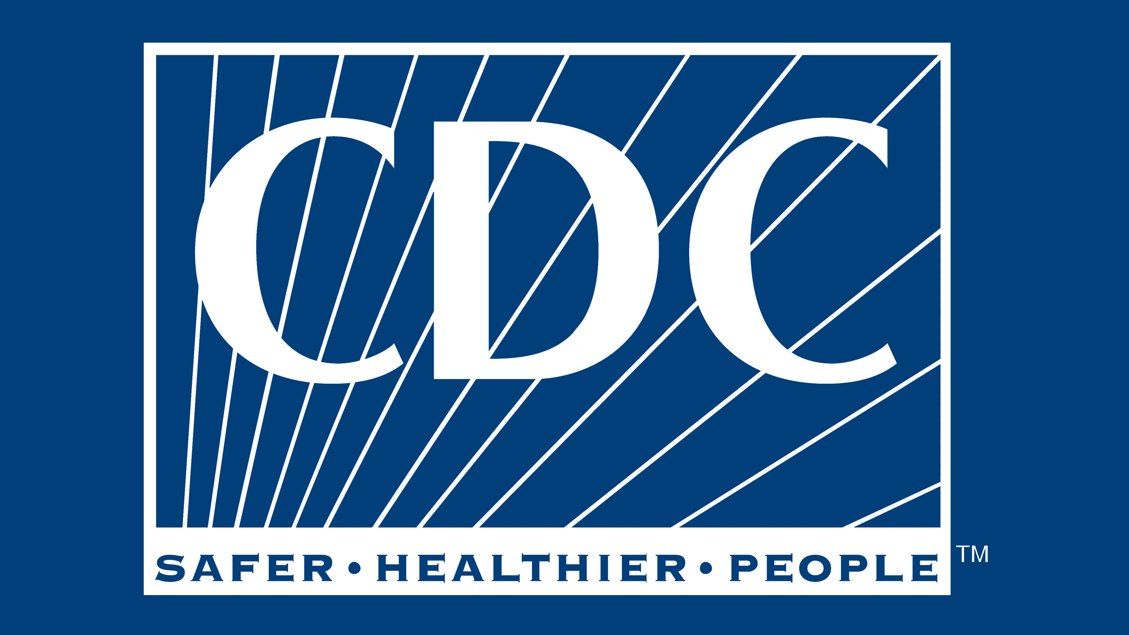
The fonts used for the name and acronym differ. As the acronym of the company name is written in large letters, its font has uppercase sans-serif letters with sharp upper tails. The ‘D’ character is typical and doesn’t have any special features. The lower inscription features a bold sans-serif typeface with wider gaps between capitalized letters, most of which have small cuts at the ends. One of the features of this font is that all letters are capitals, but the first characters of each word except for ‘and’ and ‘for’ are larger than others.
Colors
The CDC corporate designers decided to use a simple yet easy color scheme to use on various backgrounds. For the acronym and diagonal lines on the rectangle they made a white coloring. The rectangle and the letters of the lower inscription are colored blue, which makes them visible and stylish in the whole composition. In special occasions when it’s necessary, the color palette may change to black and white, though blue and white is their main combination of shades.


