BT is a communication services provider, which was established in 1969 in the United Kingdom. The company offers mobile telephony and internet products, along with IT and network services, and digital TV. Today the provider serves almost 20 million customers across the globe through its British offices and subsidiaries.
Meaning and history
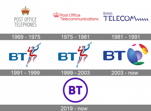
The company has changed its name three times during its history, which of course affected its visual identity. Created in 1969 as Post Office Telephones, the provider changed its name to Post Office Telecommunications in 1975. The British Telecom appeared in 1981 and finally turned to BT in 1991.
1969 – 1975
The very first logo of the company featured a modest gray wordmark in all capitals executed in a strict sans-serif typeface. The emblem, depicting an ornate gold and red crown was placed above it, to represent the British roots of the service provider and to show its value of heritage and roots.
The gray and red color palette with gold and green details is a reflection of professionalism and power, which accents on the main characteristics of the company.
1975 – 1981
The redesign of 1975 brought a new style of the lettering and a refined color palette, which was now composed only of two colors — red and white.
The crown was now placed on the left of the wordmark, which was executed in an outlined sans-serif font, with only the first letters of the words capitalized. The logo stayed with the company for only six years, until the next name change.
1981 – 1991
British Telecom was born in 1981 with a completely different visual identity concept. Its minimalist logo was now composed of a custom nameplate, with “British” on the upper level in a thin sand-serif, and a bold all-caps of the “Telecom”, with five diagonal lines, following the letter “M”, and five dots. The inscription was executed in purple, symbolizing balance and creativity.
The emblem of the company featured a stylized letter “T”, with two dots replacing the right part of its horizontal bar. The letter was placed inside a solid yellow circle with a purple outline. It was a bright and recognizable symbol, which made the company stand out on the list of its competitors.
1991 – 1999
The name of the company was changed to BT in 1991, so the logo needed to be changed. The new emblem was designed by Wolff Olins and features a bold wordmark with a blue and red emblem of the running man with a pipe, later the logo got the name “The Piper”. The image was supposed to symbolize the new approach of the company — focus on individual clients. It was a unique and memorable emblem, which made the company popular across the globe.
1999 – 2003

In the 1999 update, the color scheme was brightened marginally.
2003 – 2019
Another redesign was held by the company in 2003, in order to symbolize its expansion to international markets. The wordmark remained almost untouched, but the emblem was changed dramatically.
It was a stylized image of the globe, which was also designed by Wolff Olins. A symbol of connecting people across the globe, it featured several bright colors, which made the whole logo look sleek and modern.
2019 – Today
The current logo of the company was launched in 2019. It is the most minimalist one among all the versions and looks contemporary and strong.
Two capital letters, “B” and “T”, are enclosed in a circle and placed on a white background. The purple and white color palette is a tribute to the very first logo of the BT company, the one from 1981.
The new logo looks simple and laconic, perfectly reflecting the professionalism and trustworthiness of the service provider and showing it as a reliable one.
Font
The BT wordmark is executed in a bold and simple sans-serif typeface, which is very close to NeoGram Heavy and Heading Pro fonts, with their clean and neat lines and distinct edges and corners.
The inscription looks powerful and stable, evoking a sense of quality, safety, and responsibility.


