Cazadores is one of the oldest tequila brands. It was founded in 1922 by Don José María in Jalisco, Mexico. Since 2002 it a part of the Bacardi Limited. Cazadores still uses its original 1922 recipe.
Meaning and history
The Cazadores brand was born in 1922 in Aradanas, Mexico. Farmer Don José María Banuelos was looking out his window at the hilly area where the blue agave was growing, and suddenly he saw the silhouette of a deer standing in the center of the field. The proud posture of the noble animal struck Don José, and he realized that he had found a symbol representing his smooth highland tequila. An image of a deer’s head topped with heavy branching antlers still adorns the Cazadores bottle to this day.
As for the name of the brand, “Cazadores” means “Hunters”. This tequila is often called “the hunter’s tequila”. It automatically falls into the premium category because it is 100% blue agave juice.
What is Cazadores?
Cazadores is the name of a Mexican tequila brand, which was established in 1922, and is considered to be one of the oldest labels of tequila in the world. The company, founded by Don Jose Maria, has its products distributed all over the globe today.
Before 2014

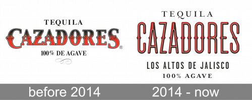
The central wordmark originally consisted of bold serif letters styled like metal. There were also some protrusions in the center that made them look like wrought iron. The color was a gradient between the red (below) and black (above). In addition to that, they also wrote ‘tequila’ and ‘100% de agave’ above and below the main part, using black, thin serif letters.
2014 – Today
The Cazadores logo was designed by Duffy & Partners design bureau, based in Minneapolis, USA.
It’s logo consists of a wordmark and a mascot image. The spiky wordmark resembles prickly agave plant. With its red and black color palette it’s an attention-grabbing wordmark.
The Cazadores mascot, a powerful stag – which Don José María admired from his farmhouse window – is a central figure of the label. It’s drawn with a huge attention to detail and symbolizes confidence and masculinity.
The designers used Spanish words in labeling, to celebrate the tequila’s genuine Mexican origin.
The Cazadores logo looks very modern and shows the premiality of the product, while keeping some traditional elements.
Font and Color
The elegant narrowed lettering from the primary badge of Cazadores is set in a stylish wishbone-like font with the tall capital characters decorated by delicate sharp details. The closest fonts to the one, used in the Cazadores insignia, are, probably, Roundwood JNL Regular, and Gothic Tuscan around, but with some minor modifications.
As for the color palette of the Cazadores visual identity, it is based on a combination of red, black, and white, the most traditional and powerful tricolor, which stands for stability, confidence, and passion, and makes any logo timeless and elegant.


