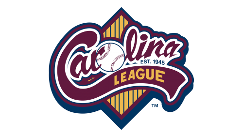
The script used for the word “Carolina” is unusual to the point of quirkiness. From the first glance, it may look like one more nice and soft script imitating handwriting. And yet, if you take a closer look, you’ll notice the unique shape of the glyphs, the inner life of their angles and curves. Even the two letters “a” don’t look the same – the first one is larger and softer, while the final one is sharper and smaller.
The initial “C” on the Carolina League logo has an extended lower end accommodating the lettering “League” in yellow. There’s a baseball instead of the “O.”
What is Carolina League?
Carolina League is an American baseball organization, which was established in 1945, and today consists of 12 team-members from the states of the Atlantic Coast of the USA. The league is affiliated with the Minor Baseball League (MiLB).
Font and color
The Carolina League logo features two styles of lettering — the mainline, executed in a custom script typeface with the baseball replacing the central letter “O”, and the uppercase “League” tagline, set on a wavy elongated tail of the “C” in a more traditional font. The font of this uppercase inscription is pretty close to TT Norms Pro Condensed ExtraBold or ITC Blair Pro Condensed Bold fonts with classic stable shapes of the sans-serif letters and thick clean lines.
As for the color palette of the Carolina League’s visual identity, it is not very usual for the sports industry, as uses a burgundy-red shade as the main one. The wine shade of the scripted wordmark is complemented by the bold white outline and yellow vertical stripes on the background, and together these shades created an exquisite tricolor, which makes the logo of the league stand out in the list of competitors.


