Le Tour de France or “The Great Loop” is an annual multi-day professional cycling race with a traditional start on the last Sunday of July. The Tour stretches over 23 days and is considered the most prestigious and challenging cycling race in the world.
Meaning and history
The Tour de France was originally set up as a promotional project by L’Auto (an ancestor of the current L’Équipe), its editor and co-founder, Henri Desgrange, to compete with the Paris-Brest cycling race (sponsored by Le Petit Journal), and the Bordeaux-Paris cycling race. The idea for the French loop came from L’Auto journalist Géo Lefèvre, with whom Henri Degrange had lunch at the Café de Madrid in Paris on November 20, 1902.
The success of Le Tour de France was a great success for the newspaper L’Auto, whose subscribers grew from 25,000 in 1903 to 65,000 after the Tour; in 1908 the number of subscribers passed 250,000, and during the Tour de France in 1923, 500,000 copies of the newspaper were sold per day. The newspaper achieved a record circulation of 854,000 copies per day during the 1933 Tour de France. Today, the Tour is organized by the Tour de France Society, a branch of the Amaury Sport Organization, which is part of a media holding that includes the newspaper L’Équipe.
The Tour de France consists of 21 stages. Each stage lasts one day. Each rider must complete a stage for his time to be recorded and accumulated.
The general classification is the ranking of riders according to their accumulated time. The winner of the whole Tour is the rider whose total time (i.e. the sum of the times of all stages) is the lowest among all the competitors. It is possible to win the entire Tour without winning a stage overall (Greg LeMond did it in 1990). Winning a stage of the Tour is considered a great achievement for a cyclist, regardless of the rider’s final position in general. The full length of the race is between 3000 and 4000 km (as the courses and length of stages change every year).
In addition to the main award in the Tour de France, there is such a thing as the “Leaders’ Jerseys”:
- The yellow jersey (le maillot jaune)The yellow jersey symbolizes the leader of the Tour de France. The yellow jersey is worn by the Tour’s time leader and is the most expensive of all the prize jerseys. The color of the yellow leader’s jersey was originally associated with the newspaper that sponsored the Tour (the newspaper had yellow pages).
- Green jersey (le maillot vert). The green jersey is awarded to the rider with the most points in the sprint classification. The jersey has been played since 1953.
- “Pea” jersey (le maillot à pois rouges). The white jersey with red polka dots is worn by the “mountain king” of the Tour. The “mountain king” jersey in French is called maillot à pois rouges, which can be translated as “red polka dot jersey”.
- The white jersey. The white jersey is worn by the best young rider (under 25 years of age on January 1 of the year in which the race takes place). The jersey has been played since 1975.
- Award to the attacker (Prix de la combativité). The most aggressive (combative, attacking) rider at the end of a stage is awarded a special number on the next day – white on a red background (instead of black on white). One of the most important criteria: is being at the breakaway from the peloton, trying to stay in it as long as possible, endless attacks. The most aggressive rider is chosen by a panel of experts.
What is Tour de France?
The Tour de France is the most famous and prestigious cycling race in the world, held for over a hundred years in France. The Tour is held in France and the neighboring countries and takes place annually for three weeks in July. Only during World War I and World War II, the Tour was canceled. The cycling race is organized by the Amaury Sport Organization, which also organizes the Paris Dakar Rally.
In terms of visual identity, the Tour de France is very creative and stylish. Its unique logo is widely recognizable and is full of energy and motion, just like the famous race itself.
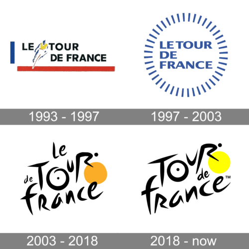
1993 – 1997
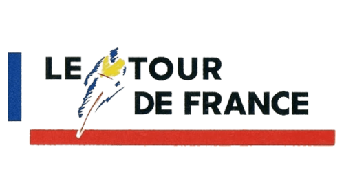
The logo, used by Tour de France at the beginning of the 1990s, was executed in the color palette of the national flag of France, blue, white, and red, but with an addition of black for the lettering, and yellow for the emblem, which depicts an athlete in the yellow leader jersey, drawn in an abstract style. The emblem was placed on the left side of the rectangular banner, between the “Le” and the “Tour”, written in bold capitals of a geometric sans-serif typeface.
1997 – 2003
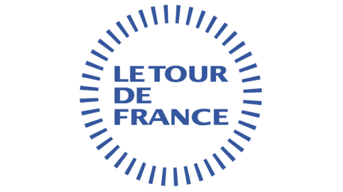
The redesign of 1997 has introduced a light and delicate version of the Tour de France logo, executed in a smooth blue and white color palette. The name of the event was written on a plain white background in three lines, using a bold and stable sans-serif typeface with wide uppercase characters. The wordmark was enclosed into a circular frame, made of thin rectangular rays, set at a significant distance from each other.
2003 – 2018
In 2003 the new Tour de France logo was created, and you can still see its main elements in the current badge. It was a black custom lettering in a cool designer font, in black, written over a plain white background with the dot inside the letter “O”, making it look like a bicycle wheel, and a solid yellow circle on the right, placed as if it was the second wheel, and forming an abstract bicycle out of the characters.
2018 – Today
The redesign of 2018 has kept the style and color palette of the Tour de France logo, but now the black lettering is written on a solid yellow banner (with the shade of yellow getting lighter), and the second “wheel” turning white. The contour of the “O” is now closed, so the letter looks like a perfect circle, unlike the one from the previous badge.
Font and color
The cool custom lettering from the primary Tour de France logo is set in a designer handwritten typeface which has a slight resemblance to such commercial fonts as Gibson, Honeydroptrade, or YD Winter, but with significant modifications.
As for the color palette of the Tour de France visual identity, it is based on a combination of black, white, and yellow, where the bright sunny shade stands for the Yellow Leader Jersey, the main symbol of the famous race.


