Capgemini has been known as a French IT services and consulting company. It was established by Serge Kampf in 1967. Originally, it was designed as an enterprise management and data processing company. The initial name was Sogeti, which was the abbreviation of “Société pour la Gestion de l’Entreprise et le Traitement de l’Information.”
Meaning and history
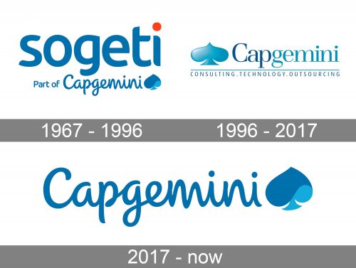
Although the company has changed its name more than once, the Capgemini logo has always featured the ace of spades.
1967 – 1996 (Sogeti)
The earliest logotype featured a square shape broken down into four fields. The first three fields each housed two letters from the company’s name. The fourth field housed the ace of spades, which has been the brand’s symbol ever since.
A corporate legend tells us that the original ace of spades symbol was developed by the founder. Before he did so, he tried to work with an advertising firm. They came up with three ideas:
- a bee (a symbol of effective work)
- a cog (to represent a magnetic tape drive)
- an ace of clubs (as something that represents luck and happiness).
Kampf didn’t like any of these but developed the card theme. He decided to make the ace of spades the centerpiece of the logo. The reason was that it is known as the strongest card (color) in the bridge, which he would often play as a student. As such, the ace of spades, in Kampf’s view, was a great symbol for joint strength.
The ace of spades was deformed and had a crushed base because Kampf wanted it to look unusual and memorable.
What is Capgemini
Capgemini SE is a provider of information technology and consulting services based in Paris, France. Out of its 270,000 employees, approximately 125,000 are in India.
Eventually, the palette combined blue and red. Interestingly, the corporate legend claims that Kampf directly borrowed the colors from the logo of the French oil giant ELF. He saw an article about that logo explaining that the blue was used as a symbol of stability, while the red symbolized dynamism. The text also said the company paid 50 million Francs for the design.
Having borrowed the colors, Kampf reportedly told his team: “At least, we’ve saved 50 million”.
1996 – 2017
A new emblem was introduced, to reflect the name Cap Gemini. It combined two shades of blue. A lighter turquoise shade represented information technology, while navy blue stood for management consulting.
While the logo was updated in 2004, the two shades of blue were preserved. They were still used with the same symbolic meaning.
2017 – present (Capgemini)
The design grew more dynamic. There was a creative touch due to the deformed ace of spades shape. The logo also somehow conveyed the promise of a personal approach due to the cursive script.
In its press release, the company called the shades of blue used in the 2017 logo “more vibrant.” To be blunt, it seems that in actual fact the colors seem slightly grayer. However, this doesn’t in any way spoil them. Anyway, the palette is unique enough and appealing.
Each of the colors carries a certain meaning. The dark blue stands for “the depth of the brand’s heritage,” as well as its dependability. This interpretation might be not so obvious, but on the whole, blue is often associated with loyalty when it comes to the psychological symbolism of colors.
The light blue, in the brand’s view, stands for “the new world – energetic, inspiring and free-thinking”. This is even less obvious as energy and free spirit are more often associated with colors like red, orange, yellow, or some unusual shades. So, the customers probably won’t perceive this message.
Colors and font
The palette is refined and unusual, and it does contribute to the effectiveness of the Capgemini logo. The cursive script adds a personal touch.


