Luna is an American company selling a range of home improvement products. Its primary focus, though, is everything that you may need to make the floor, from carpet, hardwood, and laminate to vinyl, to tile.
Meaning and history
The moon has been an integral part of the Luna logo, as well as the night sky. This approach seems to be the most natural one, given the name of the brand. While there were notable modifications over the years, the logo still retained its essence, which meant that the design remained recognizable, and the loyal customers weren’t confused.
What is Luna
Luna has been known as a flooring company based in the United States. It has several offices in Illinois, including Oakbrook Terrace, Deerfield, Kildeer, Naperville, and Schaumburg.
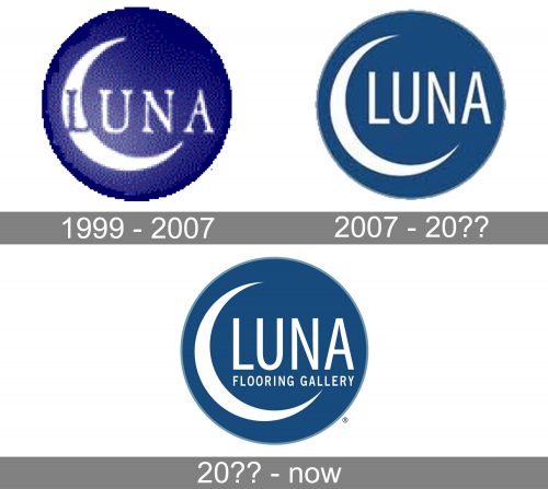
1999 – 2007
The original logo already has the structure that later became associated with the brand. First, there is a white crescent in the left-hand part. The word “Luna” is set in a light type with elegant serifs. The “L” overlaps with the moon. This glyph is dark blue, while all the other glyphs are white to stand out against the dark background.
The wordmark and the moon are placed inside a dark blue roundel representing the night sky. What makes the design truly unique and gives it an artistic touch is the ragged shape of the outer border of the roundel. It looks as if it has been drawn by hand with some kind of paint.
The creative mood perfectly fits the company’s specialization – after all, so many of us start home improvement projects not because our homes really need improvement but just because we need a change or want to find an outlet for our creativity.
Having said that, it’s still important to acknowledge that this artistic touch makes the design difficult to reproduce on various surfaces. The ragged shape, as well as the gradient, doesn’t work well at smaller sizes. These are major drawbacks for any logo, so it’s only natural that the company eventually simplified its visual brand identity.
2007 – 20??
The updated Luna logo has by far cleaner, simpler lines. The moon is still there – it’s probably the element that has changed the least.
The wordmark is still set in rather light and elongated capital letters, although, this time, they belong to a sans serif type. This contributes to the overall minimalistic effect.
And it goes without saying that the decorative jagged edge, which had probably been a pain in the neck for the design team, was also straightened. Now, you can even embroider this logo without losing its essence – something impossible for the previous design.
We should also mention that the color became slightly more generic and lost its mysterious night sky mood.
20?? – present
The company decided to make its visual brand identity more understandable and added the explanatory tagline that read “Flooring Gallery.” This might have been a wise move, given the fact that neither the name nor the emblem in any way related to the type of products on offer.
Then again, putting a long tagline inside the emblem made the design cluttered and more difficult to reproduce. It’s also not very legible at smaller sizes.
Colors and font
The original shade of blue appeared slightly more unique than the muted shade used in the following versions. There was even a mystic quality to it.
The clean lines of the letters make the Luna logo highly legible. While the elongated and light sans serif typeface may seem generic, it’s not a problem here as the logo itself already has a distinctive style.


