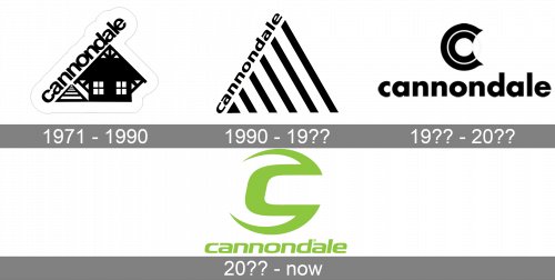
The Cannondale logo has gone through at least three updates before it adopted its current sleek style.
Meaning and history

The company was based in 1971 by Joe Montgomery and Murdock MacGregor. Originally, it specialized in precast concrete housing. Today, it is called the Cannondale Bicycle Corporation and is the US division of Canadian conglomerate Dorel Industries.
What is Cannondale?
Cannondale is the name of an American bicycle manufacturing company, which was established at the beginning of the 1970s and today is a part of the Dutch Pon Holding group. The brand has its manufacturing facilities in Taiwan and its headquarters in the United States.

The current logo features the word “Cannondale” in an austere sans. None of the letters is capitalized. There is also an emblem showcasing a 3D letter “C.”
1971 – 1990

One of the earliest logos features a red isosceles triangle. It was standing on its longer side, while the word “Cannondale” in black was written along one of its shorter sides (the left one, to be precise). The problem with this logo was that the side of the triangle was pretty short, so the wordmark stretched far beyond it, and it looked somewhat clumsy hanging in this way.
1990 – 19??

In 1990, the company resolved the above-mentioned issue. Now, the triangle grew larger. It had three equal sides. The triangle was made up of black and white parallel stripes. Similar to the previous version, the word “Cannondale” was written along the left side of the triangle, only this time, the letters were smaller, so it was possible to get rid of the “hanging” effect.
19?? – 20??

We should also mention the Cannondale logo dominated by the double “C.” The glyph was made up of two open rings. Below, there was the name of the brand, which was given in lowercase letters, like in the previous version.
20?? – now
The cool progressive Cannondale logo, introduced after the redesign, held in the 2000s, looks completely different from all the previous versions. The badge is set in a bright shade of neon green, a very unusual color, which evokes a sense of motion and progressiveness. This shade is used both for the stylized futuristic emblem of the brand and for the lowercase italicized lettering, set under it. The Cannondale emblem depicts a modified letter “C” with elongated tails, bent to the left and with their ends sharp.
Font and Color
The stylish futuristic lettering from the bright Cannondale badge is set in a custom italicized font with the square shapes of the lowercase characters. The closest fonts to the one, used in this insignia, are, probably, Corporatus Regular Italic, or Vipnagorgialla Semi Bold Italic, with some significant modifications of the characters’ contours.
As for the color palette of the Cannondale visual identity, it has just one shade in it, the neonlime-green, which is very bright and lively and makes the logo of the brand stand out in the list of its competitors. This shade represents speed and motion, brilliantly reflecting the specialization of the company.


