BASF is the name of the world’s biggest chemical company. It was established in 1865 in Germany and today distributed its products across the globe, having its production facilities on all the continents. The company has a yearly revenue of almost 69 billion euros.
Meaning and history
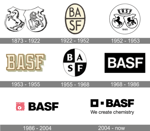
The modern history of the BASF visual identity started in the early 1980s, when the company chose the style, perfectly reflecting its values, character, and approach. Since that time the logo was redesigned only once, in 2004, but when you look at two versions, you definitely see the connection, so the BASF visual identity is very consistent.
1873 – 1922
The very first BASF logo was composed of two traditional crests, connected to each other like two puzzles. The left one had an image of a horse on it, while the right one depicted a lion rampant with a shield. This version of the logo stayed with the company for almost half a century.
1922 – 1952
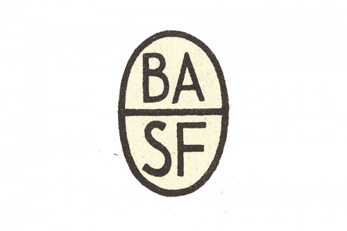
Their initial logo was a vertical oval with beige contents and black contours. It was divided into two equal parts holding the letters ‘BA’ and ‘SF’ respectively – both bits also completely black. The font was a usual sans-serif typeface.
1952 – 1953
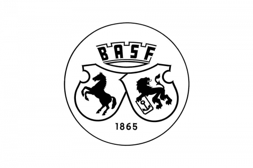
This version was simpler: a black round contour with black-and-white contents inside. These included two shield crests – with a horse on the left, and a lion on the right. Moreover, there’s also a year ‘1865’ written below them and the company’s acronym written above. This, in particular, is put inside a linear composition that looks like a crown.
1953 – 1955
The redesign of 1953 introduced a modern and stable logo, based on stylized geometric lettering in the uppercase of a custom serif font, with the capital letters outlined in brown, shadowed in grayish green, and placed against a plain white background. This version of the logo only stayed active for a bit less than two years.
1955 – 1968
In 1955 the BASF badge got one more redesign, bringing back the original monochromatic color palette. The concept was based on a vertically-oriented oval medallion, divided into four equal segments in black and white, with one of the letters of the company’s name set in each of the segments, in whether black or white.
1968 – 1986
Another redesign was held by the brand in 1968, and created the most minimalistic and strict banner, with the bold white uppercase lettering in a geometric sans-serif font, written across the solid black rectangle. This was a very laconic yet powerful logo, which stayed with the company for almost twenty years.
1986 – 2004
The logo, designed in the 1980s was composed of a bold black inscription with a stylish yet minimalist emblem on its left. The lettering in a traditional geometric sans-serif looked solid and confident, evoking a sense of reliability and trustworthiness, while the red emblem with its thin smooth lines added to the creativity and passion of the company.
The emblem was composed of a red swirl, placed inside a white square. In the middle of the swirl there was one bold red dot, and on the upper part of the square — red “BASF” lettering in thin sand-serif.
2004 – Today
The logo was redesigned in 2004, keeping the style of the previous version. Though the color palette and emblem were changed, the inscription is still executed in a traditional and bold sans-serif typeface with clean straight lines, sharp angles, and distinct cuts.
The emblem now features two squares — the left one is bigger and featured a thick gray outline, while the one on the right is small and solid-colored gray. The size of the smaller square is just the same as the white part of the bigger one, so it looks like a puzzle, where one detail is split into two.
Another significant change of the BASF visual identity is the tagline, which was missing in the previous version. Now “The Chemical Company” inscription is placed under the main wordmark. Each word is written in a title case and features a simple yet perfectly balanced sans-serif for thin clear lines.


