

![]() Canberra Raiders Logo PNG
Canberra Raiders Logo PNG
The original logo of Canberra Raiders, an Australian rugby league football club, has always featured a warrior wearing a helmet. The current emblem looks by far more professional and distinctive than the first one, though.
Meaning and history
![]()
The history of the team dates back to 1981 – that’s the year when the Canberra franchise was accepted. It became the 14th team for the 1982 NSWRFL season.
What is Canberra Raiders?
Canberra Raiders is the name of a professional rugby club from Australia, which was established in 1981. Today the club competes in the National Rugby League, has Canberra Stadium with a capacity of 25 thousand as the home arena, and Ricky Stuart as the head coach.
1981 — 1999
![]()
The original Canberra Raiders logo featured a medieval raider wearing a helmet with horns. The warrior was given in white and blue and placed over a lime green circle. Around the lime green circle, there was a thick yellow ring housing the text “Canberra Raiders” in black.
The design of the original kits was developed by Patricia Taylor. She introduced her work at the design competition in 1981 and was named the winner.
2000 — 2019
![]()
In comparison with the first logo, version 2000 looks especially professional and unique. To begin with, the palette has been chosen carefully so that the colors would fit one another. By contrast, in the previous logo, the colors didn’t form an eye-pleasing or memorable palette.
On the previous logo, the warrior appeared sad and disappointed, while on the current one he is tough and somewhat aggressive. Such a mood is undoubtedly better for a logo of any sports team. The helmet looks more intimidating now. It has a sharp center, while the horns stand wider. On the previous logo, the top of the helmet was rounded, while the horns seemed to be squeezed.
Oh, and haven’t we mentioned the impressive beard? Come to think of it, the fact that it’s colored lime green, black, and green can give you a smile. And yet, the colors don’t really pop out and seem to fit the overall style perfectly.
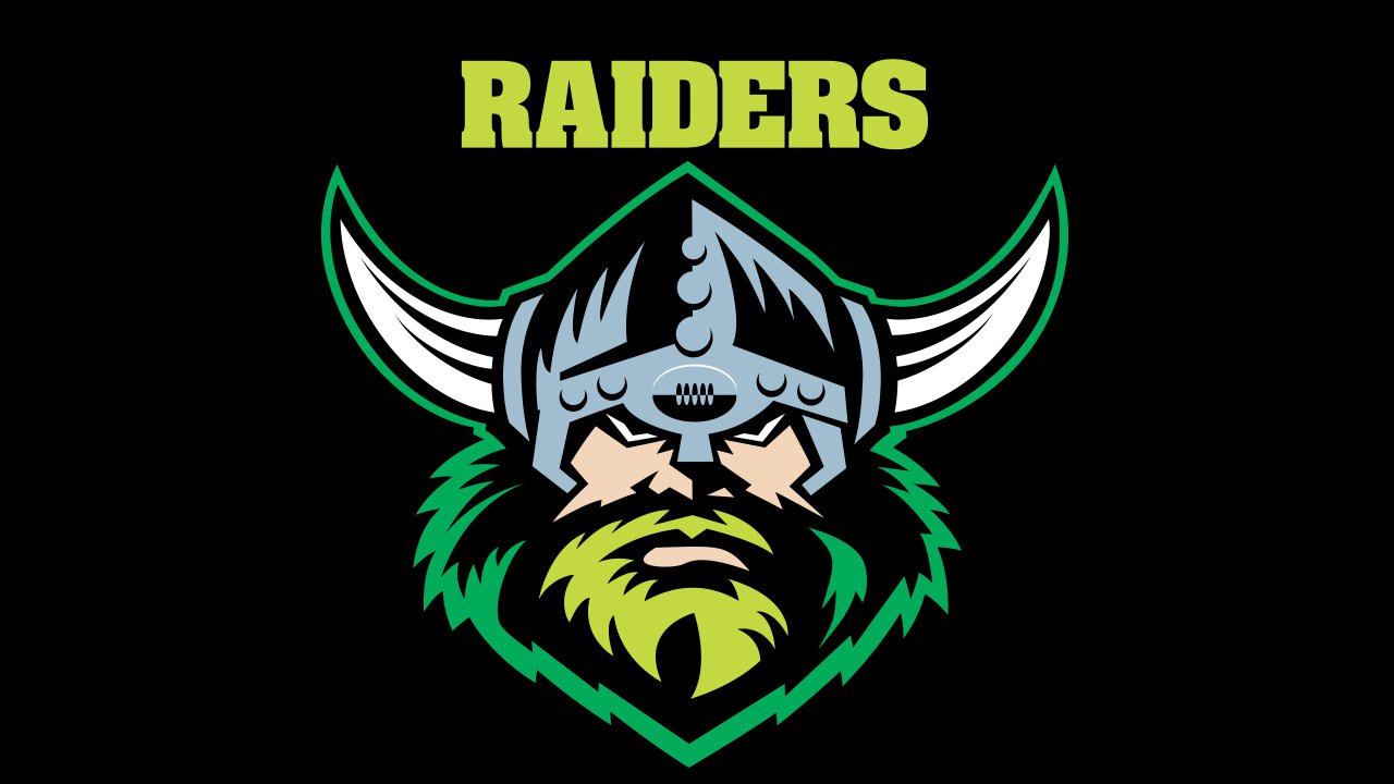
2019 — Today
![]()
The Canberra Raiders’ visual identity was refreshed in 2019. The contours of the main hero, the Vikings, were cleaned and emboldened, and the color palette was lightened up, by adding more lime green shades to the beard of the man. As for the logotype, placed above the emblem, it was also slightly changed and is now written in a more modern yet narrows font, with the “Raiders” part in solid lime green.
Font
The heavy, bold letters used for the word “Raiders” are an excellent fit for the tough guy depicted on the emblem. While neither of the fonts featured on the Canberra Raiders logo looks very unique and memorable, they seamlessly merge with the overall design.
Colors
![]()
Lime green and white were the team’s primary colors ever since it played its first game. Additionally, the official palette includes blue and gold as accent colors.
The club opted for the lime green as it was quite unusual among rugby teams in Australia and thus helped to make the brand recognizable. The blue and gold were chosen as the most popular sporting colors of the Australian Capital Territory.


