As Parramatta was established in 1946, it’s hardly a surprise it originally didn’t have an official nickname, mascot, and logo. It was rare for Australian rugby league teams founded before the 1980s to get all these immediately after they were established.
Meaning and history
Parramatta Eels is one of the Australian National Rugby League clubs, which was established in the middle of 1940 as simply Parramatta. The club usually takes a position in the middle of the tournament line-up, so can’t be called the strongest or the most popular Australian rugby team. Although the visual identity of Parramatta Eels is definitely one of the brightest.
The name of the club is derived from “Barramattagal”, the Aboriginal word for the place, where the eels live. So starting the early 1980s, the depiction of an eel has never left the club’s identity.
The club is also recognizable by its bright blue and yellow uniform, and the mascots, Sparky and Sparkles, two giant blue and yellow eels, which are present in every game of the team.
What are Parramatta Eels?
Parramatta Eels is the name of a professional rugby club from Australia; which was established in 1946. Today the club competes in the National Rugby League, has CommBank Stadium as its home arena, and Brad Arthur as the head coach.
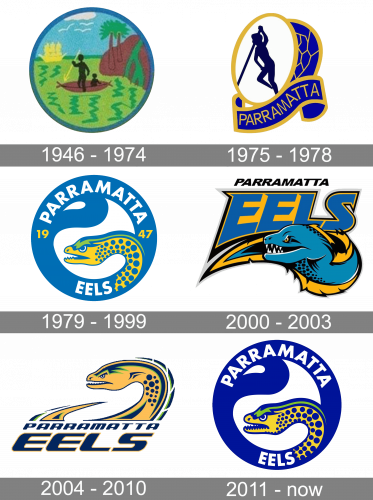
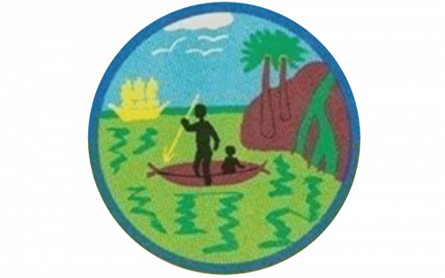
1946 — 1974
During its early years, the team was sometimes referred to as “Fruitpickers” (because there was a lot of orchards in the vicinity), but this word has never received the status of the official nickname.
1975 — 1978
It was only in the 1970s that Parramatta adopted its first official mascot. Several years earlier, in the mid-1960s, the team got its current name, the Parramatta Eels. The reason for choosing this word was pretty transparent for anyone familiar with the history of the Parramatta District. The name “Parramatta” was actually taken from the Aboriginal dialect, where it meant literally “a place where the Eels dwell.” The word was suggested by Peter Frilingos, a rather well-known rugby league journalist, who lived in Sydney.
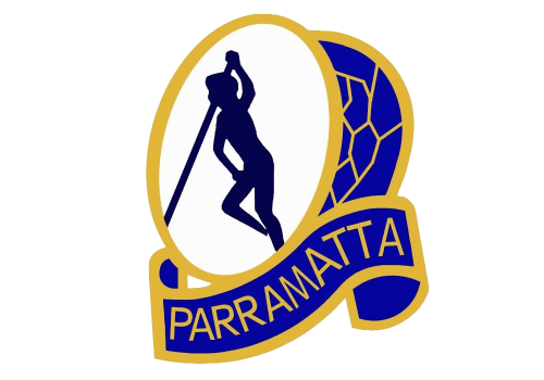
You can come across an old Parramatta Eels logo depicting a human figure with a pole inside a ring. The ring, in its turn, is formed by a stylized eel’s body. Below, there’s a banner “Parramatta.” The logo combines black, white, dark blue, and a rich shade of gold.
1979 — 1999
In 1979, a new logo was introduced. While it was also based on blue and yellow, the shades were completely different, and green was added to the palette.
For the first time, the logo depicted an eel’s head. The creature had a menacing expression on its muzzle – it appeared ready to attack. The head was housed in a blue circle featuring the words “Parramatta Eels” in capitals.
While the players’ kits were redesigned more than once, the crest itself remained virtually unchanged until 1999.
2000 — 2003
For a brief period from 2000 to 2003, the club used a different logotype. There were a lot of sharp angles, and the eel had visible white teeth. Also, it was more dynamic than its predecessor – you could feel implied motion even in the way the letters changed its size from the initial “E” to the final “S.” And yet, there was a cartoonish feel, and also the eel didn’t look as if it was seriously going to attack. You could even perceive something friendly about it, in spite of the sharp fangs, as if it was smiling.
2004 — 2010
The next Parramatta Eels logo (2004-2010) solved this problem. It was dynamic and had a more serious mood. Once again, it was the side view of an eel’s head with its mouth open, and you could also see the end of the sharp tail. In spite of all the advantages of this logo, you could perceive it looked somewhat unfinished.
2011 — Today
In 2011, the club returned to the emblem looking very much like the one used in 1979-1999. The ring encircling the eel’s head was now of a slightly different shape, and there was also the year when the club was founded – 1947.
Colors
While the colors originally proposed for the club were emerald green and white, the founders opted for blue and gold, which have been used, with some variation, ever since.


