The Bulls trace their roots to 1938. It was then that the Northern Transvaal Rugby Union achieved the status of an independent club after separating from the Transvaal Rugby Football Union.
Meaning and history
The new team was called Northern Transvaal. For their first match, they wore uniforms of the Pretoria Combined team, which featured red and gold, the colors of Pretoria.
We should point out, though, that these uniforms didn’t stay with the club for long – the players got light blue jerseys with the now iconic Barberton Daisy, which was used as the club’s emblem until 1997.
The overall style of the original Bulls logo may seem somewhat old-fashioned, which is hardly a surprise as the emblem was adopted over 80 years ago.
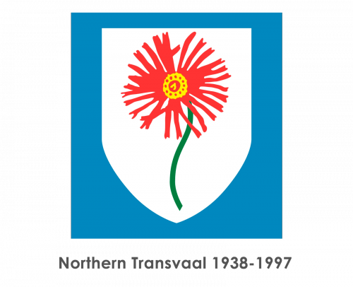
In the very center, you can see a delicate flower with long, thin red petals and a yellow center. The Barberton Daisy (also known as Gerbera jamesonii and the Transvaal daisy) was chosen as a plant indigenous to South Eastern Africa. The plant was first described as far back as in 1889. While exploring the Barberton area in Mpumalanga Province, South Africa, the botanist Robert Jameson came across this plant and prepared its scientific description. By the way, the Barberton daisy is used as a symbol of the Province of Mpumalanga.
On the logo of Northern Transvaal, the flower on a dark green stem was placed inside a white shield. The shield, in its turn, was positioned inside a light blue square. Unlike the flowers we typically see on logotypes, the Barberton daisy looked pretty realistic. The artist made some of the petals slightly uneven or turned to the side. Due to this, the picture appeared more true-to-life than, for instance, on the coat of arms of the Province of Mpumalanga.
From the other hand, the design lacked the minimalism, dynamism, and tension required for a good sporting logo. So, in spite of the fact that the shield had a long history, the club eventually had to replace it with something that better fit the modern design trends.
1997 — 1998

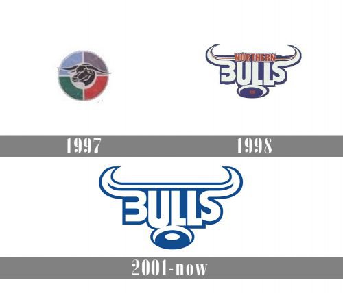
The initial Bills badge, introduced in 1997, stayed with the club for just a few months but looked very confident and aggressive. It was an image of the Bull’s head drawn in solid black with thin white details, placed inside the circular “window” in the center of the rounded badge, formed by four segments — in sky blue, grass green, red and calm dusty purple.
1998 — 2000
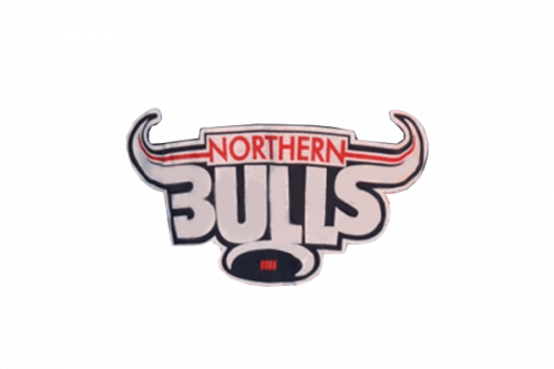
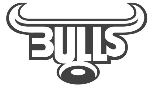
The redesign of 1998 completely changed the visual identity of the club, drawing the badge in the shape of a stylized Bull’s head, with a white background and thick black outline, and placing the enlarged “Northern Bulls” inscription right on it. The lettering was set in two levels, with the “Northern” in the uppercase written in red and executed in a strict and stable sans-serif typeface, and the “Bulls” repeating the shape of the horns with its “B” and “S”.
2001 — Today
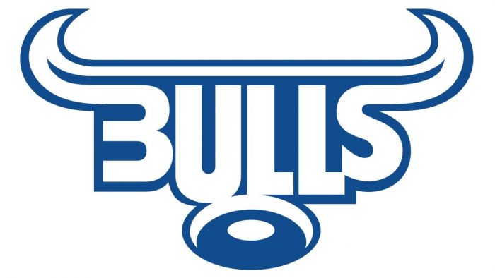
Today, the logo features a bull’s head in white and blue. Unlike the previous emblem, the bull’s head is highly stylized.
Font
While the letters “U” and “L” have a more or less regular shape, the initial “B” and the final “S” are very unusual. For instance, to make them merge with the bull’s head, the author of the Bulls logo extended the ends making them parts of the horns.
Colors
Light blue has been the team’s official color ever since it appeared on the jerseys and the emblem back in 1938.


