

![]() South Sydney Rabbitohs Logo PNG
South Sydney Rabbitohs Logo PNG
The South Sydney Rabbitohs have several logos, which they mix and match. Yet, their brand identity has remained pretty consistent throughout the last 70 years. The fact that the logo has always featured a rabbit seems perfectly natural for a team nicknamed Rabbits or Bunnies.
Meaning and history
![]()
To understand the South Sydney Rabbitohs logo, we need to learn more about how the name of the team appeared and what it means.
While the word “rabbitoh” is now nothing but history, it was very often used at the turn of the 20th century. A rabbitoh was a hawker who caught and skinned rabbits and then earned money by selling their meat. While walking around the markets, they would shout “rabbit-oh!” to get as much attention from the people around as possible.
What are South Sydney Rabbitohs?
South Sydney Rabbitohs is the name of a professional rugby club from Australia, which was established in 1908 in New South Wales. Today the club competes in the National Rugby League, has Stadium Australia and Redfern Oval as the home arenas, and Jason Demetriou as the head coach.
1959 — 1988
![]()
The first time the running white rabbit was seen on the uniforms was in 1959. Since then, it has never disappeared from the jerseys.
The original logo featured a rather plump white rabbit. The creature was running from the right to the left. It was housed in a crimson ellipse with a warm green filling. Above the rabbit, the word “Rabbitoh” in white could be seen, while below it, there was the lettering “Est. 1908.”
1988 — 2008
![]()
In 1988, the emblem was slightly tweaked. The designer redrew the animal making its head larger and its body slimmer. The eye grew larger and more expressive, and there were a couple of strokes added here and there. The color scheme became more vivid. The border of the ellipse was now given in a shade of green that was closer to teal. The filing was bright red. The lettering moved inside the ellipse. It now featured the full name of the club.
2007 — 2012
![]()
In 2007, the ellipse was removed altogether. This logo was introduced in advance of the centenary year (2008). The rabbit remained almost the same, just the outline became thicker. While both the old logos featured the name of the club in rather small letters, this one resolved the problem. Here, the words “South Sydney Rabbitohs” were larger, and due to this, better legible. The first line was red, while the second line was green.
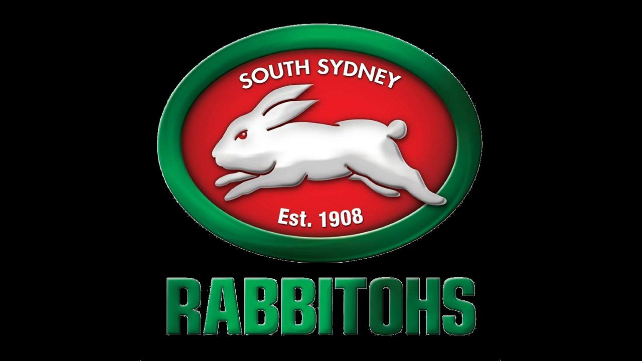
2009 — Today
![]()
The redesign of 2009 introduced a refined and modernized badge of the club. The rabbit is now three-dimensional due to the use of light-gray gradients on its bottom part. The animal is placed on a gradient red background of the horizontally stretched oval, with a thick green frame. The white “South Sydney” is arched above the rabbit in the uppercase of a classic sans-serif, and the “EST. 1908” datemark is written under the mascot, in smaller yet bolder letters.
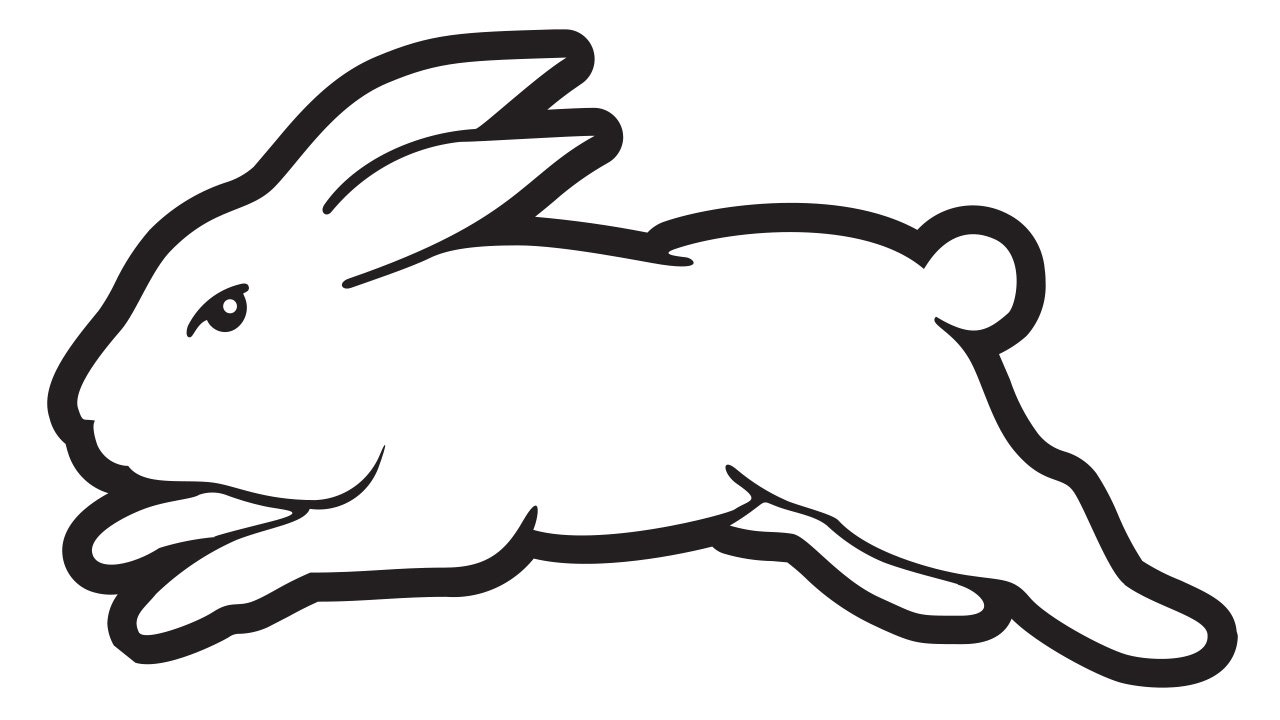
2015 — Today
![]()
In addition to the ellipse logo, the team often uses a simple depiction of the rabbit without any additional details.
Colors

The rabbit has always been either white or white with a gray gradient. As for the green and red, which has been present on almost all the versions of the logo, there was some playing around with the shades. Also, the South Sydney Rabbitohs logo has often used black as an accent color.


