

![]() Newcastle Knights Logo PNG
Newcastle Knights Logo PNG
While the logo of the Newcastle Knights has gone through two updates, the modifications have been quite subtle. The emblem has remained consistent in its overall structure, shape, and palette.
Meaning and history
![]()
The original Newcastle Knights logo was based on a shield with a rather thick blue border. Inside the shield, there was a side view of a medieval knight’s helmet with a long red hackle. The helmet was white with the black border, the hackle was red. On the background, there was a bright blue shape. Inside the shield, you could also see the text “Newcastle” in blue (above the helmet) and “Knights” in black (below the helmet). Each of the words featured a different decorative type. In the case of the word “Knights,” the letters were ornamental to the point when it damaged legibility.
1988 — 1997
![]()
The difference between the updated emblem and its predecessor were so subtle that some fans probably wouldn’t have noticed them unless they compared the two versions side by side.
The shield was replaced by a square with a thinner border. The helmet was redrawn, which resulted in a sleeker design. The hackle grew more prominent. Both blue and red appeared slightly darker and more saturated.
The problem with legibility was solved (almost). The word “Newcastle” was now given in capitals. Although they were somewhat thin, they still looked more legible than the ornamental type on the previous logo. As for the text “Knights,” the letters became by far larger. Now, they spread beyond the borders of the square. The large “K” merged in the helmet design due to the extended top right end, which became part of the helmet.
1998 — 2007
![]()
Apart from a couple of new strokes here and there and a lighter shade of blue, the 1998 logo looks almost exactly like its predecessor. We can point out the way the letter “K” is tied with the emblem.
2008 — 2019
![]()
The redesign of 2008 simplified the Newcastle Knights visual identity by removing the blue background and framing from the logo. The new badge was cleaner and brighter and featured the knights’ helmet in black and red placed on a white background and accompanied by a two lines inscription under it. The upper lines featured a bold blue “Knights” written in the same elegant gothic font with elongated lines as on the previous badge, and the bottom had blue uppercase “Newcastle” in all capitals of a traditional sans-serif font written on it.
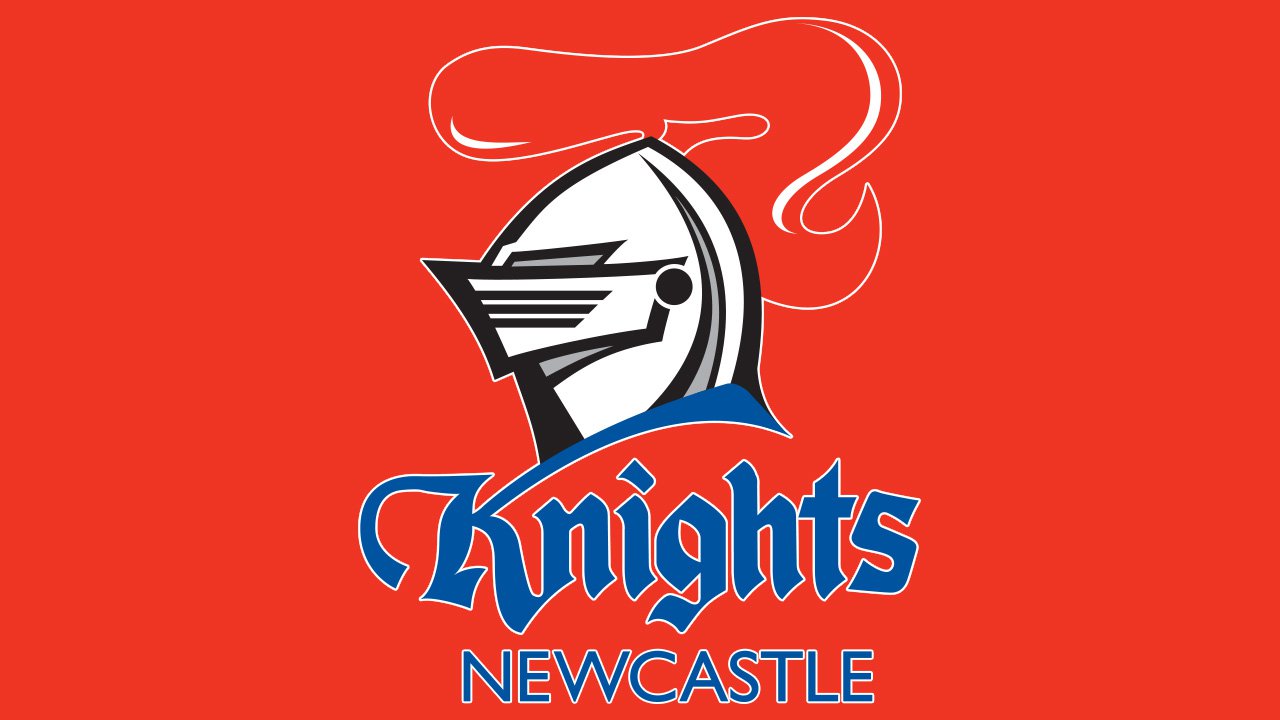
2020 — now
![]()
The lines of the badge were emboldened and modernized again in 2020. The helmet was redrawn in stronger and wider contours and was turned to the right now. As for the lettering part of the emblem, it was shortened to just one line, “Knights”, which was rewritten in a modern and sharp custom typeface with slightly elongated triangular serifs on some of the letters.
Font
There’re two completely different types on the Newcastle Knights logo. The custom font used for the word “Knights” has a medieval feel that fits the name of the team and the helmet design perfectly. In spite of its unique style, the text is pretty legible both at smaller and larger sizes. The word “Newcastle” is given in a clean sans serif type with rather regular glyphs.
Colors
![]()
While the official palette has always been built up of red, blue, and white, there has been some playing around with the shades over the club’s history. As for the logotype, it has always featured black in addition to the three colors mentioned above.


