The brand identity of the New Zealand rugby football team the Crusaders has been criticized for religious and cultural reasons. After the Christchurch mosque shootings, the club promised to modify the Crusaders logo.
Meaning and history
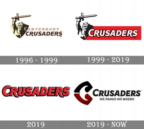
The visual identity of the football team from New Zealand has had three major redesigns thoroughly a pretty short history of the club. Though the first two versions were almost identical, in 2019 the Crusaders introduced not even one, but two new logos, one of them became official.
1996 — 1999
The initial emblem for Crusaders was created in 1996 and boasted a horizontally oriented banner with an image of a knight on the left and a bold italicized wordmark in two levels, placed on the right from the knight. The image was executed in a pale-yellow and brown color palette, while the text-part of the logo featured slightly different shades of the same colors. The knight, placed on a shield-like background, had his hand with the sword up, and the sword was placed horizontally, pointing to the right.
As for the inscription, its upper level featured a “Canterbury” lettering in outlined yellows, and the bottom line comprised an enlarged “Crusaders” in dark-chocolate tone.
1999 — 2019
The redesign of 1999 switched the color palette of the logo to red, black, and white, barely touching the composition itself. The main change of these years was in the removal of the upper part of the inscription, and on the addition of a red horizontal banner, where the refined wordmark was now set.
2019
The first logo Crusaders introduced in 2019 featured a minimalist yet bold and bright wordmark executed in red with a black outline. The letters were capitalized and whiten in a slightly italicized sans-serif typeface with the lines of both “R” elongated and a bit curved.
2019 — Today
The previous badge only stayed with the club for a few months, and a new emblem was designed later in 2019. The badge we all can see today is composed of a stylized emblem and a wordmark with a tagline. The emblem features an elegant letter “C”, composed of two parts in black and burgundy, with their ends softened and curved.
As for the main wordmark, written in black, it is executed in a custom typeface with thick lines and playful elegant ends of the letters, which are a bit diagonally elongated and sharpened.
Original symbol
The knight and the sword were given in black and white. To the right, there was the name of the team in white letters with the black outline. The wordmark was placed in a bright red square. Due to the black shades, the letters had a slightly noticeable 3D effect to them.
Colors
The combination of red and black is the traditional color scheme for sports in Canterbury’s, so it’s only natural that it was chosen for the Crusaders logo and jerseys.


