

![]() Sydney Roosters Logo PNG
Sydney Roosters Logo PNG
While the Sydney Roosters have a more than 100-year history, their jerseys typically didn’t feature a crest of any kind in the first half of the 20th century. Ever since the emblem was adopted, it has always been based on a depiction of a rooster, which grew more professional with every update.
Meaning and history
![]()
The professional rugby club from Australia was established at the beginning of the 20th century. The current name of the club, Sydney Roosters, was only adopted in 2000, and before that, it was called Eastern Suburbs (from 1908), and Sydney Coty Roosters (from 1995).
Today the club, based in Sydney, plays its games in two local arenas — Sydney Cricket Ground and Sydney Football Stadium, with a capacity of 48.000 and 42.500 respectively. Sydney Roosters is managed by Joe Kelly and has Nick Politis as the head coach.
What is Sydney Roosters?
Sydney Roosters is the name of one of the oldest Australian rugby clubs, which was established in Sydney in 1908. Today the team competes in the National Rugby League, taking place in the upper part of the tournament chart. The club has its games held in Sydney Cricket Ground and Sydney Football Stadium.
1967 — 1977
![]()
The history of the professional rugby league football club dates back to 1908. The first official Sydney Roosters logo was adopted only in 1967. While the team was called Eastern Suburbs back then, this name wasn’t included in the crest. Instead, you could see the words “Easts to Win.” Interestingly enough, the season following the introduction of the logo brought no victories to the club.
In addition to the motto, which was placed inside a rugby ball, the design included a rooster or cockerel. The bird stood on the ball. One half of the bird was blue, while the other half was red. The same approach was used for the ball. The background was white.
While we don’t have any official explanation of the origins of the rooster, one source claimed the mascot was inspired by that of the French national team. The mascot of the French national team was known as “le coq” (meaning “the rooster”). The hypothesis seems quite natural taking into consideration that the Roosters’ jersey design was also inspired by the players’ kits of the French national team.
1978 — 1994
![]()
In 1978-1994, the team used a logo with a red rooster, which looked completely different from its predecessor. The bird was placed inside a white shield with a thick blue border. Above the shield, the name of the team (“Eastern Suburbs”) in blue could be seen.
1995 — 1999
![]()
The 1995 logo had a pronounced cartoonish feel. Inside a darker and more rounded shield, there was an anthropomorphized rooster. The creature was a rugby player running with a ball. On the background, the Sydney Harbour Bridge could be seen. The logo featured the new name, Sydney City Roosters, which was chosen to appeal to the club’s widening fan base.
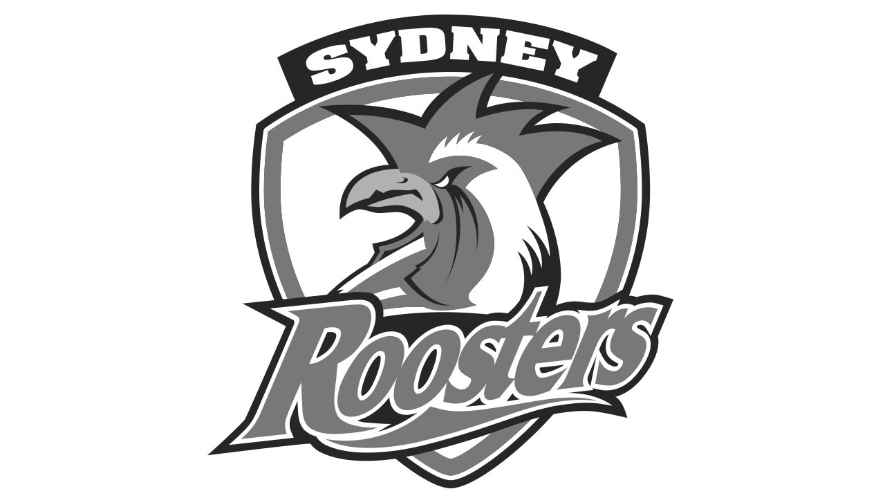
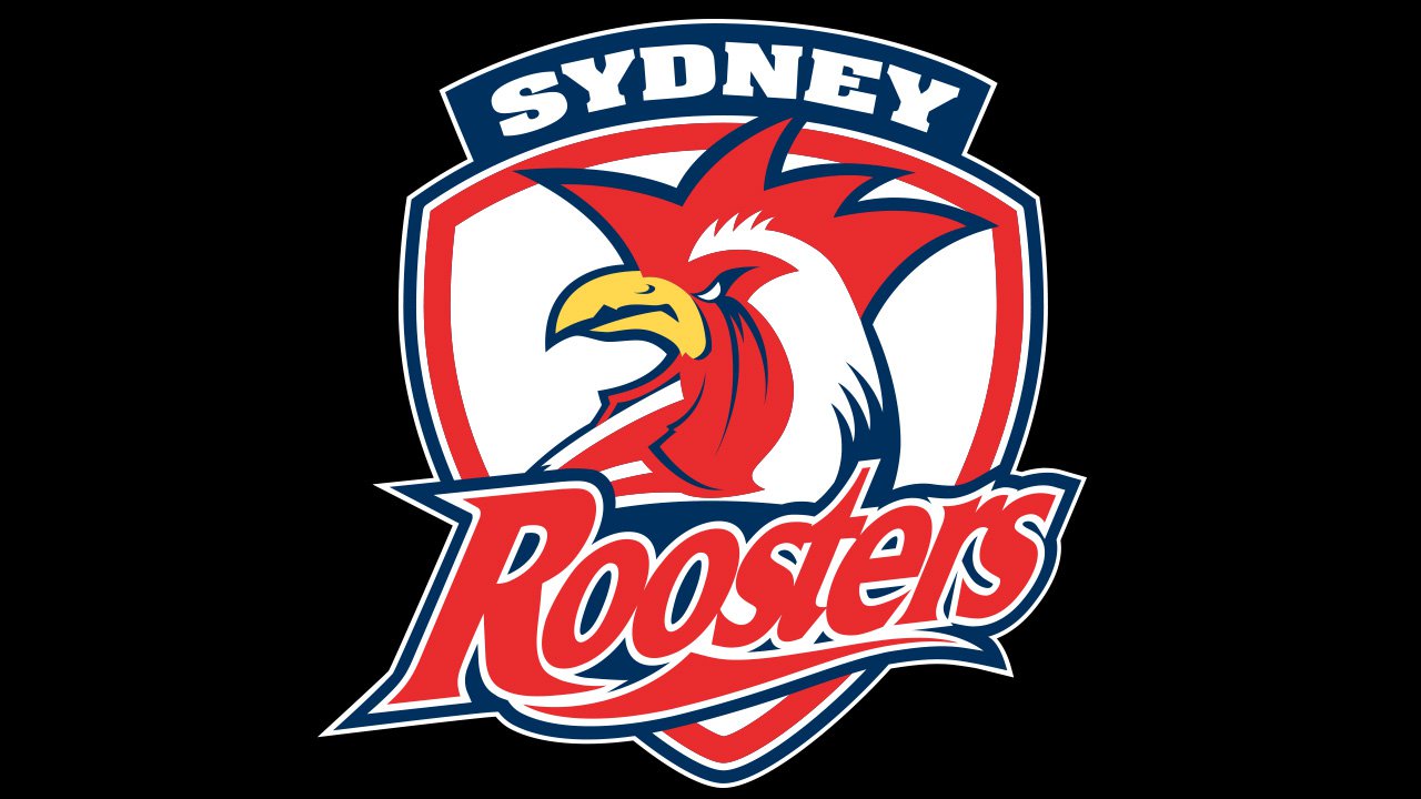
2000 — Today
![]()
When the club shortened its name to “Sydney Roosters” in 2000, the need for a new logo emerged. This time, it looked by far more serious and professional than its predecessors. The shield became edgier. The rooster featured a lot of details making it more expressive and distinctive.
Colors
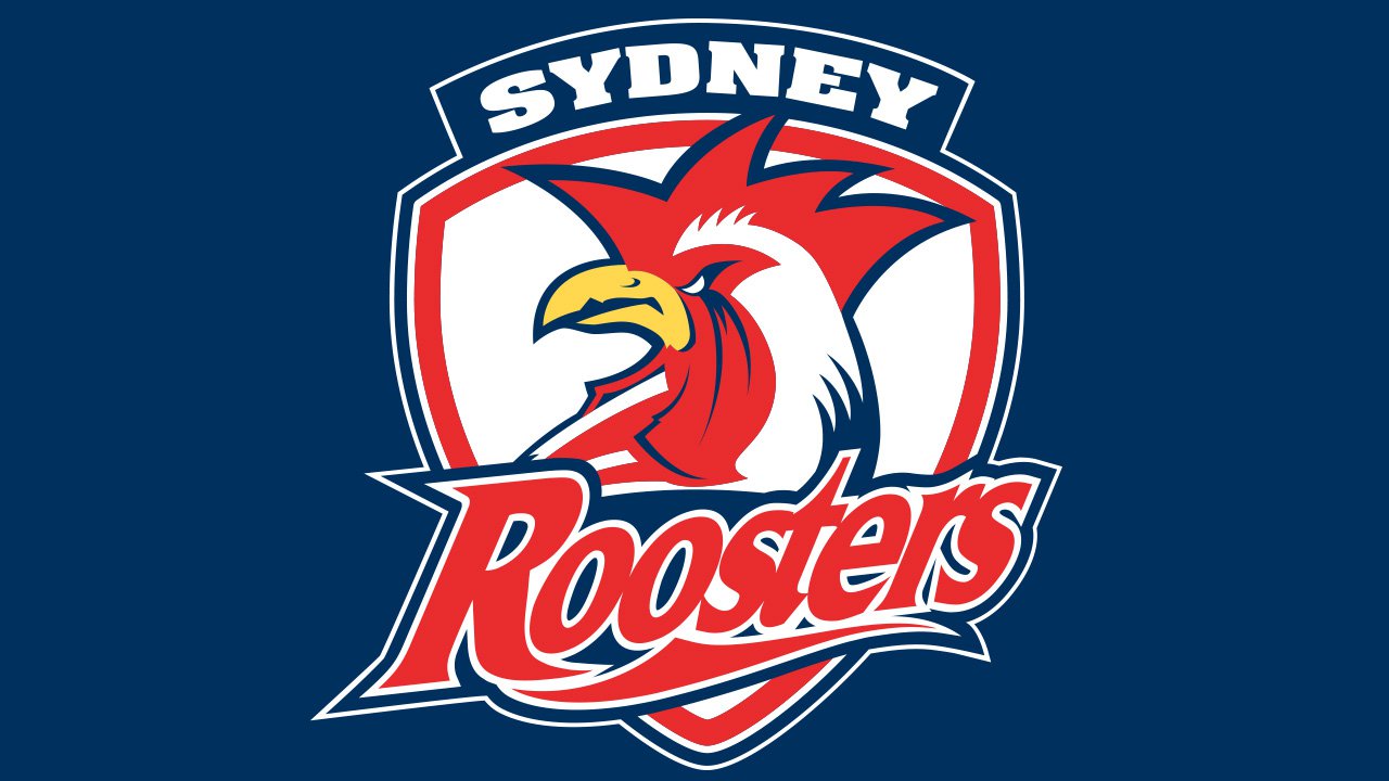
The combination of red, white, and blue has always been synonymous with the club. During the first part of the 20th century, it was used only for the jersey, and later it moved to the Sydney Roosters logo.


