 North Queensland Cowboys Logo PNG
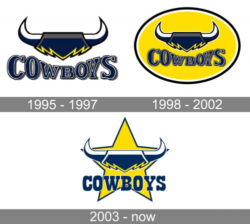
While the logo of the Australian rugby league football club North Queensland Cowboys has gone through two modifications, it has remained consistent in its core image – the top of the head with horns.
Meaning and history
North Queensland Cowboys is one of the strongest clubs in the Australian National Rugby League. Today the team is in third place in the league’s ranking, with only Cronulla-Sutherland Sharks and Penrith Panthers above it.
The Cowboys club was founded in 1992, got admitted to the Australian rugby premiership in 1995, and joined the NRL in 1998, right after the league’s foundation. Before that, the club competed in Super League. As for its success in the NRL, the Cowboys won the premiership in 2015.
What is North Queensland Cowboys?
North Queensland Cowboys is the name of a professional rugby club from Townsville, Australia. The club was established in 1992, and by today has become one of the strongest teams in the National Rugby League, the top-tier Australian league in this kind of sport.
1995 — 1997
To understand the North Queensland Cowboys logo better, let’s start from the name of the team and find out how and why it was chosen.
When the club was established in 1995, the founders analyzed a variety of potential names, including Marlins, Stingrays, and Crocodiles. Eventually, the word “Cowboys” was chosen, as the founders supposed it fit the spirit of the club best. By the way, the version “Crocodiles” was exceptionally popular, and as the club opted for another name, the name “Crocodiles” was given to Townsville’s National Basketball League.
The bold and free cowboy spirit was captured in a logo introduced the same year. The emblem featuring two sharp horns was its visual center. The emblem was dominated by navy and gray with yellow and white accents. The background was also white. Below the picture, there was the word “Cowboys” in a rather heavy bold type with slab serifs. The letters had varying height: the glyphs on the sides were higher than those in the middle.
1998 — 2002
The original logo was in use for a couple of seasons until in 1998 it was slightly updated. Now, the emblem and the wordmark were housed in a yellow ellipse with a white and navy outlines. Apart from the background shape, the logo appeared pretty much the same.
2003 — now
The ellipse logo lasted about five playing seasons. In 2004, it was replaced by a slightly modified one. The most obvious update was the five-pointed yellow star with a navy border that replaced the oval.
The letters now had the same height. The gray disappeared from the palette, while the navy became somewhat brighter and clearer.
Font
While the logo has always featured a heavy slab serif font, it wasn’t the same. The glyphs were redrawn for the 2004 emblem. Having preserved the overall style and the distinctive slab serifs, they have a different shape now.
Colors
Navy blue and yellow were the team’s official colors since its early days. The founders opted for the palette because it was linked with the colors of the Townsville representative sides. The palette also included white (as a primary color) and gray (as a secondary color).
The current North Queensland Cowboys logo features navy, yellow, and white.


