![]() Manly-Warringah Sea Eagles Logo PNG
Manly-Warringah Sea Eagles Logo PNG
Manly Warringah Sea Eagles arethe name of a professional rugby club from Sydney, Australia. The club was founded in 1946, and today competes in the National Rugby League the top-tier Australian league in this kind of sport.
Meaning and history
![]()
Manly Warringah Sea Eagles is one of the oldest Australian rugby clubs, established in 1946, and having its first season played in 1947. That was in the New South Wales Rugby Football League, the first rugby competition in Australia, founded in 1908 and ceased in 1994.
As for the National Rugby League, the competition Manly Warringah Sea Eagles are affiliated today with, it was established in 1998. Today the league consists of 16 clubs, with 15 from Australia, and one — from New Zealand.
Whatare Manly Warringah Sea Eagles?
Manly Warringah Sea Eagles are the name of an Australian rugby club, which was established in the middle of the 1940s. Today the professional team is a part of the National Rugby League. Sea Eagles have Brookvale Oval as their home arena and Des Hasler as the head coach.
1947 – 1955
![]()
In 1946, Manly Warringah was admitted to the NSWRL first grade competition. The earliest Manly-Warringah Sea Eagles logo made its debut in the early 1950s. It was a white shield with a thin maroon outline. The shield housed the letters “M” and “W,” which were given in a plain sans serif type.
1956
![]()
In 1956 the calm and boring logo was changed to a delightful and modern emblem, where the burgundy and white eagle with smooth contours was placed on a solid yellow circle. The bird was sitting on a burgundy ball with a bold “MW” monogram on it. The letters were executed in extra thick lines and evoke a sense of power and confidence.
1957 – 1959
![]()
The logo adopted in 1957 was somewhat ambiguous, and due to this the team was often mistakenly referred to as the “Seagulls” instead of the official “Sea Eagles.”
1960 – 1977
![]()
To avoid the misconception, they had a logo redesign in 1960. The bird looked more like an eagle now.
1978 – 1979
![]()
Eventually, in 1978, the crest featuring a detailed depiction of the eagle was adopted.
1980 – 1997
![]()
In 1980 the club decided to get back to its original white and burgundy color palette, drawing the flying eagle on a white background and enclosing it into a double frame with the lettering arched along its top and bottom parts. In the center of the badge, there were no additional elements, just the image of the flying bird, which looked aggressive and determined.
1998 – 1999
![]()
The 1998 logo was even richer with details, but it also looked somewhat cluttered and had a cartoonish feel.
2003 – 2023
![]()
The simplified palette of the 2003 crest looks nobler. The bird doesn’t have to “carry” the heavy lettering on its shoulders anymore.
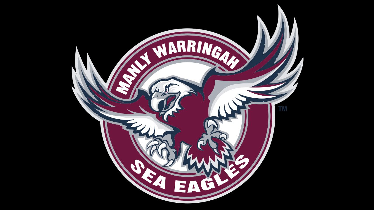
2023 – Today
![]()
The logo displayed captures the essence of fierce determination and prowess through the depiction of an imposing eagle. At a first glance, the viewer’s attention is immediately drawn to the intricate detailing of the eagle’s facial features, which evoke a sense of power and majesty. Its sharp, penetrating eyes are set deep, exuding an aura of vigilance, while the curved beak, slightly open, signals readiness, perhaps even a touch of aggression. This design choice resonates with the eagle’s reputation in the wild as a top predator, always watchful and ready to swoop down on its prey.
The plumage, beautifully represented through swirling strokes, provides an added dimension of depth and texture to the image. The interplay of curves and layers in the depiction of the feathers showcases a harmonious blend of fluidity and structure, mirroring the eagle’s graceful yet purposeful flight. The dark purple hue chosen for the logo not only imparts a regal touch but also hints at the mystery and intrigue associated with this magnificent bird of prey.
Beneath the captivating image of the eagle, the words “SEA EAGLES” are boldly inscribed, reaffirming the primary motif of the design. Accompanying this, the words “MANLY WARRINGAH” sit slightly subdued yet prominently, providing context and rooting the logo to a specific identity or origin. The choice of a modern, sleek typeface for the text complements the contemporary feel of the design, ensuring that while the logo pays homage to a timeless symbol, it remains relevant and appealing in today’s dynamic world.
Colors
Ever since the club entered the competition, it has used the combination of maroon and white for the logo. The colors were inspired by those worn by the President’s Cup side, who, in their turn, borrowed the colors from the local Freshwater Surf Lifesaving Club. At some points, other colors were added to the Manly-Warringah Sea Eagles logo.