 Canterbury-Bankstown Bulldogs Logo PNG
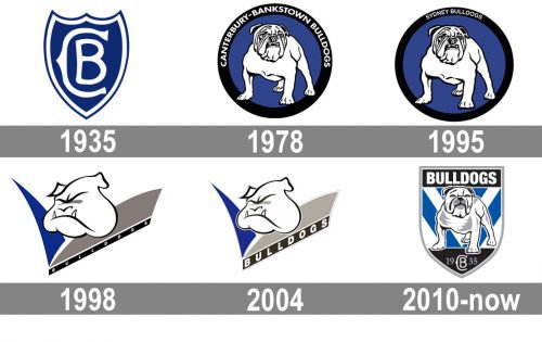
The Canterbury-Bankstown Bulldogs logo has gone through several modifications. This is hardly a surprise as the rugby league football team has over 80 years of history, and its name was changed several times, too.
Meaning and history
Canterbury-Bankstown Bulldogs is not the most successful rugby club in Australia, although it is still very popular, and has a lot of fans in its region. It can be seen by the number of nicknames the club has — Berries, Dogs, Doggies, The Family Club, The Entertainers, and Blue and Whites.
The club doesn’t have its home arena and plays in three different stadiums with different capacities — from From Belmore Sports Ground with 19.000, to Stadium Australia with 84.000. The head coach of Canterbury-Bankstown Bulldogs is Mick Potter, and the manager is Ash Crutcher.
What is Canterbury-Bankstown Bulldogs?
Canterbury-Bankstown Bulldogs is the name of a professional rugby club from Australia, which was established in 1934, and today competes in the National Rugby League. The club, based in based in Belmore, plays in three different stadiums — Stadium Australia, CommBank Stadium, and Belmore Sports Ground.
1935 — 1977
When the club was founded in 1935, it was called “Canterbury-Bankstown.” There weren’t any bulldogs neither in the name nor in the logo. The crest featured a shield with the letters “C” and “B.”
1978 — 1997
The word “Bulldogs” was adopted in 1978. The same year, a roundel emblem with a white bulldog was introduced.
1995
It stayed in use until 1997, when the team unveiled another emblem.
1998 — 2002
Now, there was only the bulldog’s head and the word “Bulldogs.”
2003 — 2009

The Canterbury-Bankstown Bulldogs logo was redesigned again in 2003. The composition remained the same, but the contours of all elements got refined and the bottom part of the emblem — strengthened and emboldened. The black diagonal banner with the lettering got wider, so the white “Bulldogs” inscription in the uppercase was rewritten in a bigger size and bolder lines. It was now more readable and its modern sans-serif typeface looked powerful and confident.
2010 — Today
Eventually, in 2010, the team adopted a shield with a white, black, and gray bulldog. The dog looked somewhat similar to the original one from the 1978 logo, although it was designed at a higher professional level.
Colors
The official palette is as simple as blue and white. For most of the team’s history, the jerseys have featured this combination. It was only during the Second World War that the blue and white strip was replaced by a maroon background and blue “V.” The modification was the result of rationing.
As for the Canterbury-Bankstown Bulldogs logo, however, it comprises a couple of additional colors, namely gray and black.


