While the style of the Camper logo is simple and unpretentious, it is also energetic and recognizable. The fact that it does not appear overloaded with detail is another advantage of this eye-catching design.
Meaning and history
The brand was established in 1975 by Lorenzo Fluxa. It is best known as a manufacturer of casual footwear. Camper is based in Mallorca, Spain, and sells its products in around 40 countries.
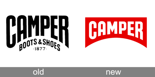
Old Logo
New Logo
The emblem of the Spanish brand features the word “Camper” in white inside a red shape. The shape looks like a combination of an arch (in its lower part) and a rectangle (in its top part).
The designers varied the height of the letters forming the wordmark to make them better fit the red shape. As a result, the initial and final letters are larger than the central one, which is an interesting approach. At the top, the letters have the same height, while their lower parts form an arch instead of a straight line.
The type is pretty bold but the overall shape of the letters is elongated. The most unusual glyph is probably the “A” with its rounded top “echoing” the arch theme.
Icon
Apart from the logo featuring the word “Camper,” the brand also uses a compact version, which is used in the situations when there is not enough space for the primary Camper logo. The icon features the same red shape as the main logo but without the writing “Camper.”


