Campari is a brand of the beverage company, founded in 1860 by Gaspare Campari in the Italian town of Novara, near Milan. Today the Campari brand is distributed in over 190 countries and is one of the most famous brands in the world.
Meaning and history
A campaign is more than an beverage. It is a brand in the fullest sense of the word. A symbol of Italian marketing and style, Campari is famous for the design of its bottlings and advertising campaigns are known around the world.
The history of Gruppo Campari begins in 1860, when Gaspare Campari from Cassolnovo in Lombardy, has mixed more than 60 ingredients to create the legendary red bitter beverage, Campari. It took the brand around a century for the whole world to know its name, and today, the word “Campari” is synonymous with high-end cocktails on each continent.
What is Campari?
Campari is one of the most iconic Italian brands of beverages, which was established in 1860, and named after its founder, Gaspare Campari. Today the label is known all over the globe, representing its country in the fanciest bars of the world.
1888 – 1905

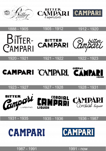
The original emblem was a sprawling, elegant word ‘Bitter’ written in black, cursive letters with the Campari coat of arms drawn on the left.’
1905 – 1912

The following wordmark design consists of three words now. There were two words ‘Bitter’ and ‘Campari’ written in two lines of serif text, the former smaller than the other & a ‘l’aperitivo’ (aperitif) beneath in cursive, thin letters.
1912 – 1920

The 1920 design is instead just the word ‘Campari’ made from white, blocky serif letters. These were fully capital letters written inside a wide blue rectangle.
1920 – 1921

After that, they tried writing ‘Bitter-Campari’ in two lines, like before. Unlike before, these used an artistic sans-serif style with grotesque shapes and twists, as well as mismatched letter sizes.
1921 – 1922

The idea stayed the same, but this time they wrote the former word centrally above the latter and used very bold serif letters with hook-like ends.
1922 – 1923

In the 1922 design, ‘bitter’ shifted to the right end of the wordmark, and both letters took on cursive, slim styles with many twists and twirls.
1923 – 1927

This is just the word ‘Campari’ written in even bolder sans-serif letters without any artistic attachments.
1927 – 1928

After that, they adopted the same word, but written in comas and with taller serif letters. Here, they decided to put the central bars either too high or too low.
1928 – 1931

This one is akin to the 1923 design: a collection of very bold sans-serif letters (although even thicker here). The words ‘cordial’ and ‘liquor’ were written above the start of the main wordmark and below its end respectively.
1931 – 1935

This one also had three layers of text: ‘bitter’ written in bold sans-serif in top right; ‘Campari’ written diagonally below it with a bold cursive font; ‘d’aperitivo’ in thin sans-serif characters beneath its right.
1935 – 1936

That’s a ‘cordial-liquor’ combination instead. This time they switched corners and took on skewed, bold styles. The central word was also visibly tilted in terms of size of specific letters.
1936 – 1987

In the 1936 design, both ‘cordial’ and ‘liquor’ became thin cursive words and moved below the central inscription. The latter took on an elegant, bold-ish serif style with overlong tails protruding from many places.
1987 – 1991

The 1987 design is a lot like the old blocky serif look – this one is also used in the following 1991 style they used for many years since. This one, however, is just the wordmark with blue letters of this particular font.
1991 – Today
Campari is like no other existing drinks: it is unique and well recognizable even when mixed in cocktails. Same thing is with their visual heritage.
Campari logotype was registered in 1912. Starting in the 1920s, Campari enlisted a number of renowned artists to create advertising posters. The artists included Ugo Mochi, Adolf Hohenstein, Marcello Nizzoli, and Leonetto Cappiello, who created the famous “Spiritello”.
The only constant detail of the Campari labels and art is their wordmark. The mark consists of a label in a rectangular-shape with a textured deep blue background design and the word “CAMPARI” on the top, executed in white.
It’s a silver-foil logo which perfectly captures the understated elegance of the world-renowned ‘red spirit’.
Custom typeface Campari Bold with its rather extended proportions and sharp serifs is affected by hand-lettered posters of early century Campari Advertising.
Font and Color
The bold geometric serif lettering from the intense Campari banner is set in a heavy serif typeface with the slightly narrowed contours of the characters and massive trapezoid serifs. The closest fonts to the one, used in the Campari insignia, are, probably, Aachen Pro Medium, or Soho Std Bold, but with the shapes of the serifs modified.
As for the color palette of the Campari visual identity, it is based on a combination of dark blue, white, and yellow, which looks very chic and stylish, and evokes a sense of excellence and quality, showing the strongest points of the brand and reflecting its values.


