Calzedonia is an Italian fashion label offering a range of bathing suits, tights, socks, and leggings. It was established by Sandro Veronesi in 1986 in Verona, Italy.
Meaning and history
The history of Calzedonia Group began in 1986 with the opening of small stores in the north of Italy. The company got its name thanks to the Calzedonia brand, under which the first stores were opened and which specialized mainly in the sale of women’s tights and stockings.
The name of the brand Calzedonia is deciphered as a combination of two words Calze – translated from Italian stockings, and donna – is a woman. In addition to hosiery products, Calzedonia stores also offer swimwear and beachwear.
The distinctive feature of the brand is a rather eye-catching design and a wide range of colors of Calzedonia products and at the same time a democratic approach to setting prices for products. As a strategy for the brand’s development, its founders chose to create and expand a franchise network of stores.
During 25 years of its work on the market, Calzedonia Group has managed to open more than 3000 successfully operating stores in more than 30 countries of the world. The head office of Calzedonia Group is located in Verona, the city of Romeo and Juliet.
1986 – 2003
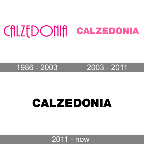
The original Calzedonia logo featured a fantasy-styled uppercase lettering in a bright fuchsia shade, set on a plain white background. The narrowed capital characters in the logotype were written in a designer font with smooth lines and an art-deco mood, which was especially visible in the shapes of both “A”s and the “N”.
2003 – 2011
The redesign of 2003 introduced a modified logo of the Italian brand, with just the fuchsia pink color remaining of the original version. The uppercase lettering was rewritten in an extra-bold sans-serif typeface with distinctive contours and geometric cuts of the lines. The characters evoke a sense of stability and strength, while the pink color adds a feminine and romantic mood, representing the purpose of the brand and its essence.
2011 – Today
The Calzedonia logo is just the name of the brand in a totally generic type. The glyphs look pretty heavy due to the bold typeface, although they still stay within common sense and legibility. The fact that there is just enough breathing space between the characters also helps to preserve legibility.
The only problem with this wordmark is that it looks as if it has been done using some kind of a default typeface. You can hardly figure out which message the brand wants to convey or which lifestyle it suggests. In a way, this is a statement in itself – such a logo means that the brand does not belong to a certain style but rather focuses on the quality and durability of its products (something implied by the heavy “durable” typeface). This is a reasonable approach for a company specializing in bathing suits, tights, and leggings.
Symbol
In addition to the primary logo described above, the brand often uses a “reduced” version. For instance, it is used as an icon on the website where there is not enough space for the full wordmark. The icon features the letter “C” looking the same as in the primary Calzedonia logo. The glyph in white is placed inside a black square box.


