

![]() Cagliari Logo PNG
Cagliari Logo PNG
Cagliari is a professional soccer club from the city of Cagliari, founded in 1920. The first decades after its foundation were spent in the lower divisions of Italy, until in 1964 it won a ticket to the Italian elite. The team played 11 seasons at the top level, winning the Italian Cup and its only Scudetto.
Meaning and history
![]()
Cagliari managed to enter the elite for the first time in 1964. In the first season at the highest level, the team managed to hang on to the seventh line of the standings. Five years later, the club finished second, missing only Fiorentina, and a year later Cagliari won gold medals, losing only two matches in the championship and conceding only eleven goals. At that time the Sardinians shone forward Luigi Riva. This was the last major success in the domestic arena for a modest team. In 1976, it left the elite of Italian soccer. They managed to return only in 1990 when the club was managed by Claudio Ranieri.
The club’s second major comeback came in 2004. It was made possible thanks to local legend Gianfranco Zola, who returned home to finish his glittering playing career. In recent history, Cagliari has had excellent ties with the South American market of footballers, and the team’s management is taking measures to attract as many Italian players as possible to the squad.
In the new millennium, Cagliari is considered a stable mid-table Serie A side but often relegated to Serie B, which is rather a consequence of the club’s unstable financial situation. Cagliari is the main club of Sardinia and the only team participating in Serie A.
What is Cagliari?
Cagliari is the name of a professional Italian soccer club from the city of Cagliari, Sardinia. The team participates in Serie A. Cagliari’s most successful European season is considered to be 1993/94. It was then that the modest provincial Italian team managed to reach the semi-final stage of the UEFA Cup.
1935 – 1971
![]()
While the soccer club was officially founded in 1920, there’s little to be said about its first logos. The earliest notable Cagliari logo was probably the one used from the 1950s to 1971. Here, you can see a shield divided into two fields, a red one (to the left) and a very dark blue (to the right). On the dark blue field, the legendary Four Moors from the flag of Sardinia can be seen. At the top of the shield, the gold lettering “U.S. Cagliary” on the white background can be seen.
1971 – 1900s
![]()
In the version used in 1971-1993, the heads grew larger, while the blue grew lighter.
1980s – 1900s
![]()
The club continued to use Four Moors from the flag of Sardinia as the main element of its logo. The profiles were done in black and had yellow wraps. A red cross separated the four profiles. The emblem itself acquired a round form with the wide border being split into blue and red halves. The blue portion featured “Unione Sportiva”, while the red one had “Cagliari”. Both inscriptions had white, sans-serif font and all uppercase letters.
1993 – 1995
![]()
In 1993 the shape of the Cagliari crest was changed to a more elegant and classy one. The softened triangle pointing down with both sides arched from the center was now executed in a dark blue and red color palette with the Italian flag ribbon waving at its bottom part, and a white-and-black wordmark banner placed above the top border of the crest. The central element was drawn in a smaller size in white and black, balancing the lettering.
1995 – 2010
![]()
The redesign of 1995 introduced a bold and modern version of the Cagliari logo. The blue and red crest was now placed in an oval, which was vertically divided into two equal parts — dark blue on the left, and red on the right. The lettering turned white and was now written above the triangular crest, inside the oval, using a traditional sans-serif typeface for its capitals. The “1920” datemark was also added to the new badge, placed under the crest in the same style as the “Cagliari Calcio” inscription.
2010 – 2011
![]()
The colors of the Cagliari badge got brighter in 2010. White lettering on the badge turned to gold, with the ornate leafy gold frame added around the oval medallion. The typeface of the “Cagliari Calcio” wordmark was switched to a bold serif one, to elevate the elegance and sophistication of the refreshed gold blue, and red composition.
2011 – 2015
![]()
The redesign of 2011 kept the color palette of the badge but darkened the shades of blue, red, and gold. As for the elements of the visual identity, they all remained the same, only the frame turned minimalist — it was now smooth and clean thick golden outline, adding confidence and professionalism to the overall classy mood of the Cagliari Calcio insignia.
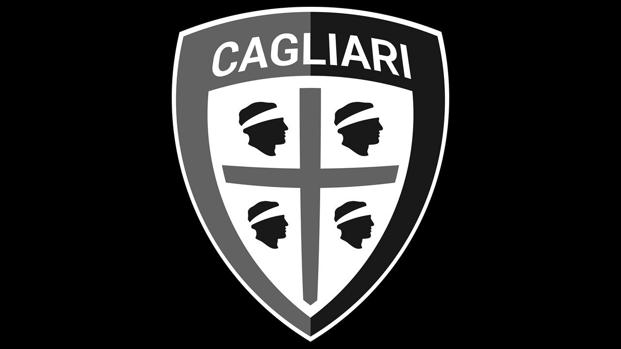
2015 – Today
![]() The flag of Sardinia features four heads and the red cross, which is known in heraldry under the name of the Cross of Saint George. The most known explanation of the emblem is that these are the heads of the Moorish princes defeated by the Aragonese.
The flag of Sardinia features four heads and the red cross, which is known in heraldry under the name of the Cross of Saint George. The most known explanation of the emblem is that these are the heads of the Moorish princes defeated by the Aragonese.
Font
![]()
The current Cagliari Calcio logo features a sans serif type, which is by far better legible than its predecessor.
Colors
While the combination of blue, red, and white has been present on all the logos, the shades have been modified over time.
Cagliari Colors
NAVY BLUE
HEX COLOR: #002350;
RGB: (0 35 80)
CMYK: (100 90 38 39)
RED
HEX COLOR: #AD002A;
RGB: (173 0 42)
CMYK: (21 100 88 15)
WHITE
HEX COLOR: #FFFFFF;
RGB: (255 255 255)
CMYK: (0 0 0 0)


