Meaning and history
In spite of the fact that the Italian football club ACF Fiorentina has modified its logo not less than ten times throughout its more than 90-year history, its central symbol has always been the same – a red fleur-de-lis on a white background.
The reason why the football club opted for the fleur-de-lis was pretty simple – it has been a long-time symbol of the city of Florence where the team has been based ever since its inception in 1926. Both the flag and the coat of arms of Florence comprise a red fleur-de-lis on a white background.
1926 – 1951

The very first Fiorentina logo was designed in 1927 and featured an elegant red fleur-de-lys image with some additional details on the ends of the elongated curved lines coming out of the middle of the composition. No additional lettering, just one bright memorable symbol on a white background.
1951 – 1963
The redesign of 1951 made the red fleur-de-lys modern and geometric. It was now drawn in straight angular shapes and enclosed into a rhombus with a dark gray outline and light silverfish background. This new badge stayed with the club for a decade and was a reflection of the progress and motion, power, and determination of Fiorentina.
1963 – 1967

In 1963 the badge get changed again, with the crest vertically stretched and the flower was redrawn, resembling the one from the very first Fiorentina logo. The elegance and softness of the fleur-de-lys elements were balanced by the strict and straight double framing of the emblem, which also featured the same red color as the main symbol of the club.
1967 – 1974
The redesign of 1967 took the badge created in 1951, and placed it on a calm blue barrel-shaped crest, adding lettering to the bottom border of the emblem. It was the “A. C. Fiorentina” inscription in all capitals of a bold outlined sans-serif typeface, executed in a tender yellow shade.
1974 – 1977
With the redesign of 1974, the vertically stretched rhombus was back again. Now the classic white and red rhombus with the fleur-de-lys on it was set on the upper part of the badge, when the bottom part was colored in deep blue and had the “ACF” monogram written on it in two levels, executed in a traditional geometric sans-serif typeface, in the dark gold shade with a thin black outline. The framing of the badge was drawn in the same style and color palette as the letters of the monogram.
1977 – 1980
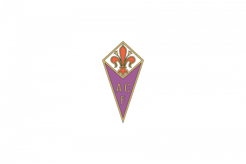
Blue was switched to light purple and the contours of the fleur-de-Lys redrawn and elongated in 1977. Now the red flower was again closer in its style to the one from the original badge — traditional and ornate. It was outlined in thin gold, just line the whole badge and the letters of the “AFC” monogram (which on this version of the logo became thinner and taller).
1981 – 1990

The badge, created in 1981, was completely different — it featured a stylized letter “F”, which had its right part resembling the signifier of the club, the fleur-de-Lys. This new element was drawn in thick red lines on a white background and enclosed into a thick circular frame in intense purple color. This was the most minimalist and modern badge out of all ever created for the football club, and it stayed with Fiorentina for almost nine years.
1991 – 2002
The redesign of 1991 brought back the iconic rhomboid logo but colored its bottom part in burgundy red now. All other elements remained in their place but still got their contours slightly refined and modernized. In the new palette, the badge started looking brighter and more recognizable. The difference between the two shades of red, complemented by gold and white, created a very interesting contrast, symbolizing warmth, attention, and power.
2002 – 2003

For just a few months in 2002, the club brings back its original logo, designed for it in 1927. With this scarlet-red fleur-de-lys placed on a plain white background, the mood of the logo became elegant and chic, and the badge looked timeless and classy, being placed on the uniform of the club.
2003 – 2022

The redesign of 2003 brought back the geometry to the Fiorentina logo, placing the white rhombus with the red flower on top of a calm purple rhombus, with its bottom part vertically stretched. Both geometric elements were outlined in a thick gold frame, while the “ACF” monogram was now executed in white and red — with white “AC” placed above the red “F”.
2021 – 2022

The world has already seen this round purple emblem with a stylized red “F”. It was used by the club during the 1981 – 1990 period. It was decided to use it again for a short period while the team was coming up with a new design.
2022 – Today

The new logo had a lot of elements in common with the previous versions. First of all, it had a white, red, and purple color palette. The outline of a square rhombus was done in purple. It was also used to draw a thick “V” shape under a simplified red fleur-de-lis in the upper half of the rhombus. Like several other logo versions, this version had no inscriptions, just symbolism.
Colors
While the colors of the city of Florence, red and white, have been present on the emblem since the club’s inception, the current badge also featured purple and gold.
Fiorentina Colors
VIOLET (PURPLE)
PANTONE: PMS 267 C
HEX COLOR: #482E92;
RGB: (72, 46, 146)
CMYK: (89, 99, 1, 0)
GOLD
PANTONE: PMS 451 C
HEX COLOR: #A29160;
RGB: (162, 145, 96)
CMYK: (37, 36, 71, 6)
RED
PANTONE: PMS 185 C
HEX COLOR: #EC1C23;
RGB: (236, 28, 35)
CMYK: (1, 99, 98, 0)
WHITE
HEX COLOR: #FFFFFF;
RGB: (255, 255, 255)
CMYK: (0, 0, 0, 0)


