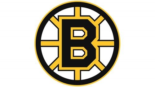
The iconic Boston Bruins logo featuring “B” inside a spoked circle was created when the ice hockey team was 25 years old. Since then, it has been tweaked several times without losing its identity.
Meaning and history
The hockey club from Boston has had two main graphical symbols in its visual identity design throughout the years. Starting the 1920s there has slays been a brown bear on the team’s logo, and at the end of the 1940s, the animal was replaced by a more minimalist and geometric object — a wheel. As of today, the hockey club uses both symbols for its secondary and alternate versions, though the official one is still built around the wheel.
1924 — 1926
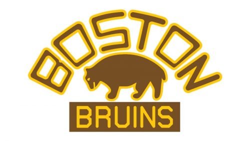
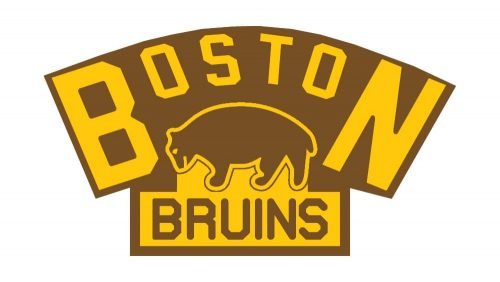 The initial logo for Boston Bruins was created in 1924 and featured a light brown and yellow badge with the outlined image of a bear in profile, standing on the yellow banner with the “Bruins” lettering in capitalized brown sans-serif, and an extended arched “Boston” wordmark above the bear, with the “B” and “N” thickened and enlarged. All the composition was placed on a brown background and the elements which featured the same color were outlined in yellow.
1926 — 1932
The redesign of 1926 switched the color palette of the Boston Bruins by separating it into three elements and placing all of them on a white background. Now the brown beat in a yellow outline, and arched brown and yellow inscription and a brown horizontal rectangular banner with yellow lettering were placed on white and looked neat and tidy.
1932 — 1934
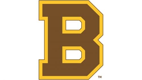
In 1932 the new logo appears. The team starts using a bold geometric letter “B”, executed in the same brown and yellow color palette, where brown is the main shade, and yellow is for the outline. The letter is slightly narrowed and tall, looking confident and solid.
1934 — 1948
The color palette of the Boston Bruins visual identity was switched from snow and yellow to black and yellow in 1934. As for the contours of the emblem, they have also been refined, making the “B” wider and shorter, adding more seriousness and professionalism to the team’s logo look.
1948 — 1949
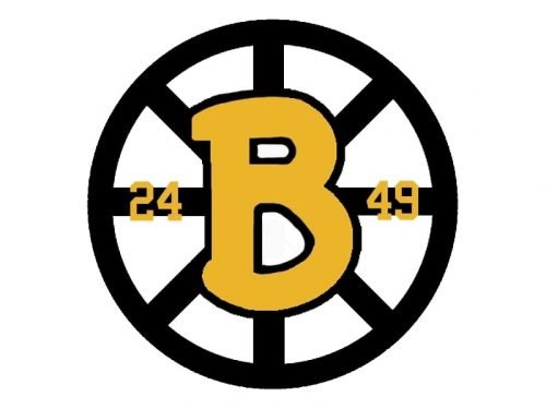
The new era of the logo design starts for Boston Bruins in 1948, with the appearance of the first “wheel” logo, where the handwritten yellow “B” in a black outline was placed on a monochrome wheel. The yellow “24” was placed on the left from the letter and “49” on its right.
1949 — 1995
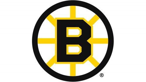
The contours of the emblem were redrawn in 1949, making the black “B” in a yellow outline square and strong. The color palette of the wheel was also switched to yellow and black, and the numbers were fine from the logo. There were also two additional versions used by the club during this period — with the yellow letter on a black and yellow wheel, and the yellow “B” on a completely black wheel.
1995 — 2007
In 1995 the logo is being changed again, and this time the square yellow outline of the letter merged with the yellow rays on the wheel. It was an interesting and modern version, which stayed with Boston Bruins for a decade.
2007 – 2023
The redesign of 2007 brought back a double yellow and black outline and made the “B” separated from the wheel again. The contours of the letter have been redrawn and it became stronger and stricter, with geometric serifs on the vertical bar, which looked distinct and bold. The iconic bear emblem is still used by the club as an additional logo version, featured cleaned contours, and strengthened and enlarged wordmark arched above it.
2023 – Today
The Boston Bruins logo is a distinctive and iconic emblem representing one of the most storied franchises in the National Hockey League (NHL). The design centers around a bold, black capital “B,” which stands for Boston. This letter is rendered in a blocky, geometric font that conveys strength and stability, symbolizing the team’s enduring legacy and formidable presence on the ice.
Surrounding the “B” is a vibrant, golden yellow spoked wheel, a nod to Boston’s historical nickname, the “Hub of the Universe,” which references the city’s importance as a central point of transportation and commerce. The wheel’s spokes radiate outward from the center, creating a sense of motion and energy reflective of the fast-paced and dynamic nature of hockey.
Encircling the entire design is a thick, black ring, which adds a layer of boldness and containment, ensuring the logo is both visually striking and cohesive. The combination of the black and yellow colors is highly effective, as these contrasting hues create a powerful and easily recognizable visual impact. The use of black exudes authority and power, while the yellow adds a touch of vibrancy and excitement.
The logo’s simplicity and clarity of design make it timeless and versatile, suitable for various applications, from jerseys to merchandise. This emblem not only captures the essence of the Boston Bruins’ identity but also pays homage to the city’s rich history and the team’s significant role in the world of professional hockey.
Font
The typeface featured on the Boston Bruins wordmark logo is available under the name of NHL Bruins. The font was crafted by Jayde Garrow.
Colors
The overall color scheme has remained mostly consistent. Although the brown color of the original Boston Bruins emblem was eventually replaced by black, it didn’t change the overall effect that much, just created a better contrast. Brown and yellow were chosen for the earliest logo so that it would fit the color scheme of the chain of grocery stores that belonged to the original owner of the team, Boston grocery magnate Charles Adams.
GOLD
PANTONE: PMS 1235 C
HEX COLOR: #FFB81C;
RGB: (252, 181, 20)
CMYK: (0, 31, 98, 0)
BLACK
PANTONE: PMS BLACK 6 C
HEX COLOR: #000000;
RGB: (17, 17, 17)
CMYK: (0, 0, 0, 100)


