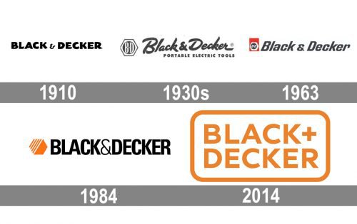
The hexagon shaped logo used by Black & Decker for more than 100 years, was eventually replaced by a cleaner, more modern wordmark reflecting the brand’s new specialization.
Meaning and history
Though Black & Decker’s visual identity has always had the logotype as its main part, there have been many redesigns of the company’s logo, with various experiments in typefaces and colors. The current emblem, created in 2014 is both the brightest and the most minimalist among all.
1910 — The 1930s
The very first logo, designed in 1910 was composed of an extra-bold black lettering in capitals with a fancy “&” sign, which added elegance and lightness to massive letters with playful shapes. The tails of the symbols were slightly curved and had their cuts arched and diagonal, which added uniqueness to the inscription.
The 1930s — 1963
In the 1930s the logotype was redrawn for the first time, and the emblem was created and put on the left from the lettering. The new inscription featured a simple gray color, yet its modesty was balanced by the wordmark’s elegance, as it was written in a custom cursive font with the tail of the “R” elongated to the right. The inscription was accompanied by a strict “Portable Electric Tools” tagline in capitals.
As for the emblem, it was composed of a gray and white hexagon with a solid gray circle inside. The “B&D” monogram in white was written in the middle of the circle.
1963 — 1984
In 1963 the logo was redesigned again, and red color was added to its palette. Now the geometric emblem was placed on the bottom part of a vertically stretched red rectangle.
The lettering was also refined and now written in a bold italicized sans-serif typeface with smooth lines and rounded angles. The color of the logotype remained the same.
1984 — 2014
The redesign of 1984 brought a new palette and new style to the Black & Decker visual identity. It was a strict and minimalist black inscription in a bold sans-serif typeface with all the letters capitalized and the “&” in lightweight lines. The wordmark was complemented by a bright orange emblem, which was composed of a solid hexagon with its upper right part in a striped white and orange pattern.
2014 — Today
The Black & Decker logo, introduced in 2014, features an orange sans-serif lettering set in two levels, with the ampersand replaced by “+”. The inscription has all its letters capitalized and placed with a lot of space between each other. The logotype is enclosed in a horizontally stretched frame with rounded angles, featuring the same shade of orange.
Font
The old Black & Decker logo used the typeface called Linotype Univers Com 620 (the Condensed Bold version). The 2014 wordmark features a more standard-looking type with justified stacking of the company name.


