Bitdefender is an antivirus software developing company, which was established in 2001 in Romania. Today the Bitdefender program is one of the most widely use antiviruses, which has over 500 million users across the world.
Meaning and history

The Romanian company Bitdefender is the developer of one of the best antivirus solutions on the market. The antivirus reliably protects all your devices from malware and viruses and does not slow down your hardware.
The company’s most popular product is Bitdefender Total Security, a comprehensive antivirus to protect home computers from viruses and threats that are compatible with Microsoft Windows, macOS, iOS, and Android.
In many ways, it outperforms similar products and provides the best protection. It works invisibly and has minimal impact on device performance. This comprehensive antivirus includes a password manager, anti-spam, firewall, Bitdefender VPN, phishing protection, and guaranteed irrecoverable data deletion. The built-in Safepay browser lets you make online purchases and online transactions safely.
What is Bitdefender?
Bitdefender is a Romanian company that develops and manufactures anti-virus, firewall, and anti-spam solutions under the BitDefender brand name. These programs are used in more than 100 countries, with more than 40 million individual and corporate users.
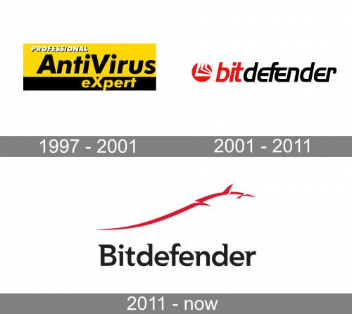
1997 – 2001

The 1997 design is a mostly yellow rectangle with a black base and text on it. The latter is written in three lines of varying size from top left to bottom right, including ‘professional’, ‘antivirus’ & ‘expert’. The colors and fonts also varied.
2001 – 2011

The original BitDefender logo was created in 2001 and stayed with the software brand for ten years. It was a simple yet strong and modern Nadir in a red, white, and black color palette, where red and white were used for the emblem, and black with red — for the inscription. The emblem, placed on the left from the logotype, featured a solid red circle with white angular lines, which created an interesting geometric pattern. As for the lettering, it was set in the lowercase of an italicized sans-serif typeface with smooth lines and straight cuts of the letters.
2011 – Today
The current Bitdefender logo is a modern and meaningful piece of art. It looks elegant and stylish, showing the main purpose of the software — protection.
The redesign of 2011 replaced the old circular emblem of the Bitdefender with an abstract image of the Dacian wold, executed in an elongated curved line with three spaces and three sharp short elements coming out of it, forming the wolf’s head.
The red emblem starts above the letter “B” of the wordmark and moves up and right, finishing above the last letter of the inscription, “R”.
The Bitdefender nameplate is executed in a sleek and modern typeface with sharp and elegant serifs, which add a sense of style and quality.
The Dacian Wolf is a symbol of strength and protection, two qualities that characterize the software most.
The black and red color palette of the Bitdefender visual identity is a reflection of a powerful and professional brand, which values progress and is constantly developing in order to meet all the needs of its users.
Font and Color
The sleek and edgy lettering from the primary Bitdefender logo is set in a custom designer typeface, which is based on Kirkly SemiBold, or Mainlux Bold, but with the ends of the bars triangularly sharp and elongated. The title case inscription looks very modern and cool.
As for the color palette of the Bitdefender visual identity, it is composed of black and red, with the most powerful duo, which shows professionalism and stability, and at the same time adds a sense of excellence and style.


