The Birmingham Barons have changed their name and brand identity more than ten times. It’s one of the oldest minor league baseball teams.
Meaning and history
The team started playing in 1885 under the name the Coal Barons. The current name was adopted rather early, in 1901, but it was used only until 1961. Having returned to it for one season in 1964/65, the team was renamed once again. At last, in 1981, the club became Birmingham Barons and hasn’t changed this name ever since.
1993 — 2007
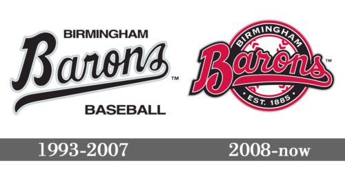
The very first Birmingham Barons badge was created in 1993 and stayed with the club for more than a decade. It was a black and white logo with the “Barons” wordmark in a bold script font, and two straight sans-serif lines above and under it — the “Birmingham” as the top level, and the “Baseball” at the bottom. Both additional letterings were executed in a bold sans-serif typeface with all the uppercase letters stable and solid.
2008 — Today
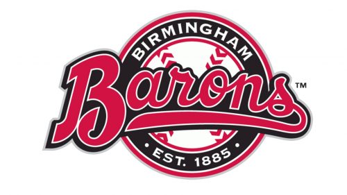
The Barons’ logo was redesigned in 2008, with the addition of red color, and some smooth rounded details. Now the wordmark was executed in a fancier and fuller font, and placed on a black, red, and white roundel, with the additional text around the black framing (in a double outline), and the center stylized as a baseball — white with red stitches. On the bottom part of the circular logo frame, there was an “Est. 1885” datemark in white symbols added.
Colors
While the franchise’s primary colors are black, red, and gray, the Birmingham Barons logo also features white as an additional color.


