 Binghamton Rumble Ponies Logo PNG
The Binghamton Rumble Ponies are a minor baseball league team competing in the Eastern League. It’s the Double-A affiliate of the New York Mets.
Meaning and history

The franchise started its history in 1987 as the Williamsport Bills, then relocated to Binghamton, New York, before the 1992/93 playing season. Here, it played under the name of Binghamton Mets before adopting its current brand identity in 2017. It was developed by the agency Brandiose.
1992 – 1994
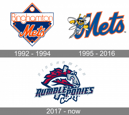
The first Binghamton Mets logotype consisted of several parts. The background was a blue rhomb outlined with orange. It had a white-and-orange ball in the upper corner, and the handwritten word ‘Mets’ below. The square was split in two parts by a white area, in which the inscription ‘Binghamton’ was located. The lower half of the rhomb, as well as the white area, was also outline somewhat with blue.
1995 – 2016
In 1995, the designers made the word ‘Mets’ the main part of the logotype. Here, it’s got a dark-blue color palette with a contour. The typeface remained the same, but the word itself got larger. The rhomb disappeared, as well as the ‘Binghamton’ inscription. The new detail they added was an image of a fresh mascot. It showed Buddy the Bee, dressed in the blue-and-white clothes and walking somewhere with a determined smile.
2017 – Today
The logo changed in 2017, as well. Now there is a bright-gray word ‘Binghamton’, written in a semi-circle with gothic font. Below it, we can see a white pony with a red mane, blue-and-red eyes, dark blue outline and a gray helmet. The pony looks aggressive, ready to strike. Below the pony, there is the team name, ‘Rumble Ponies’. It has the same typeface as the upper inscription, albeit the color scheme is blue with a gray outline. There are also red marks on all the letters.
Symbol and name

Both the name of the team and the Binghamton Rumble Ponies logo are a reference to Binghamton’s reputation as the “Carousel Capital of the World.” The city is known for its six vintage carousels. The name has caused a bit of a stir among the club’s fans, and yet, it is part of the trend for hyper-local, non-traditional nicknames, which has been rather popular among minor league baseball teams recently.
Primary emblem

The main Binghamton Rumble Ponies logo features a carousel horse with a red mane. Still, it’s not just a harmless little pony that entertains kids in the park. The grey helmet, the creature’s eyes, and its overall tension show determination and even aggressiveness.
Colors
The seemingly simple palette contains five or six colors: navy blue, two shades of red, silver (possibly two shades), and white.


